2019 has been a fantastic year at noissue. We hit 100k on Instagram (and climbing!) added two new products to our range, and enjoyed the hundreds of incredible packaging designs that customers have been sending our way.
As the year draws to a close, we felt it was the opportune time to celebrate the creativity of our customer base. In this ‘staff picks’ feature, we had our team members choose their favorite design featured on our Instagram in 2019, accompanied by a key design tip for your future packaging endeavors.
Enjoy, and happy holidays from the team at noissue!
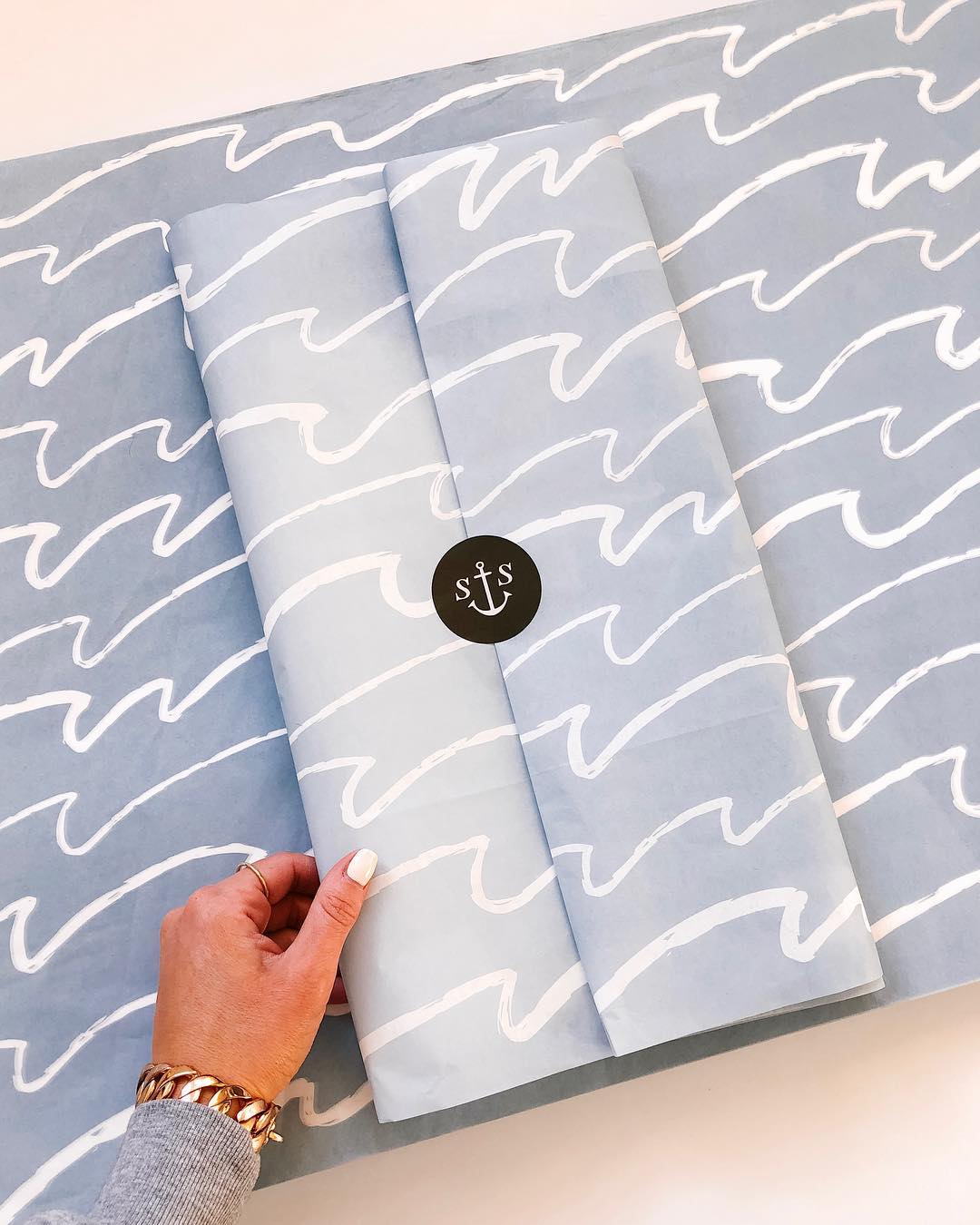
Shore Society (@shoresociety) 
“Shore Society is a nautical-themed lifestyle brand, and they have showcased this to perfection in their tissue design. I love how they have kept it clean and simple with the hand-drawn ocean waves – it really communicates their rustic and laidback personality! Putting a black sticker against the pale blue also provides a strong focal point that draws the eye straight towards their logo.” Beth Owens, Content Strategist.
Design tip #1: A packaging design doesn’t have to be complex to make a splash with your customer (pun intended!) Thinking thematically about your design ensures that your branding is cohesive and reflects your core values as a business.
Jacqueline Colley Illustration (@jacquelinecolley)
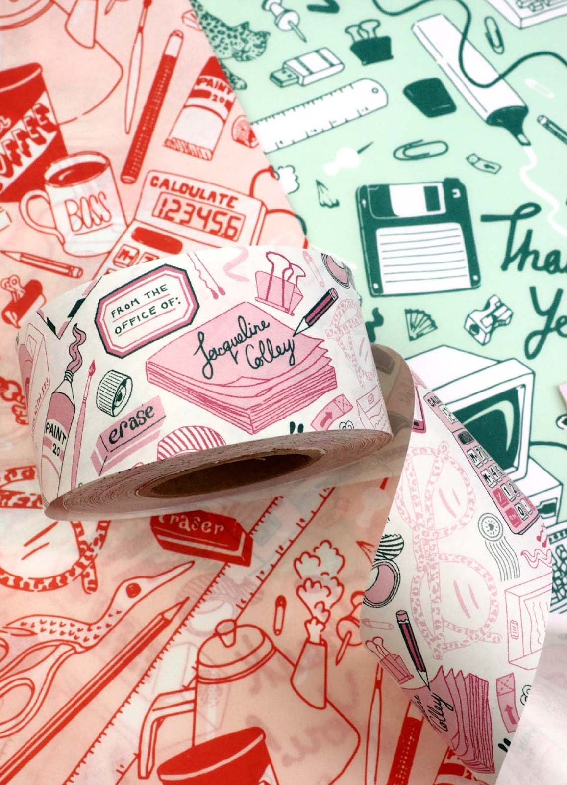
“I’ve always admired Jaqueline’s super fun and quirky aesthetic. It’s always so delightful to look closely at her illustration’s tiniest details. Choosing color schemes that would work side by side is a fundamental aspect of effective branding- which Jacqueline effortlessly aced!” Lia Amper, Collaborations Manager.
Design tip #2: Doodle-inspired designs are extra engaging for your customers – every time they look at your packaging, they will likely discover something new to admire! It’s an excellent way to communicate your brand’s personality and what makes you tick as a business.
You can read our full case study on Jacqueline Colley here.
Sugarhouse Ceramic Co. (@sugarhouseceramicco)
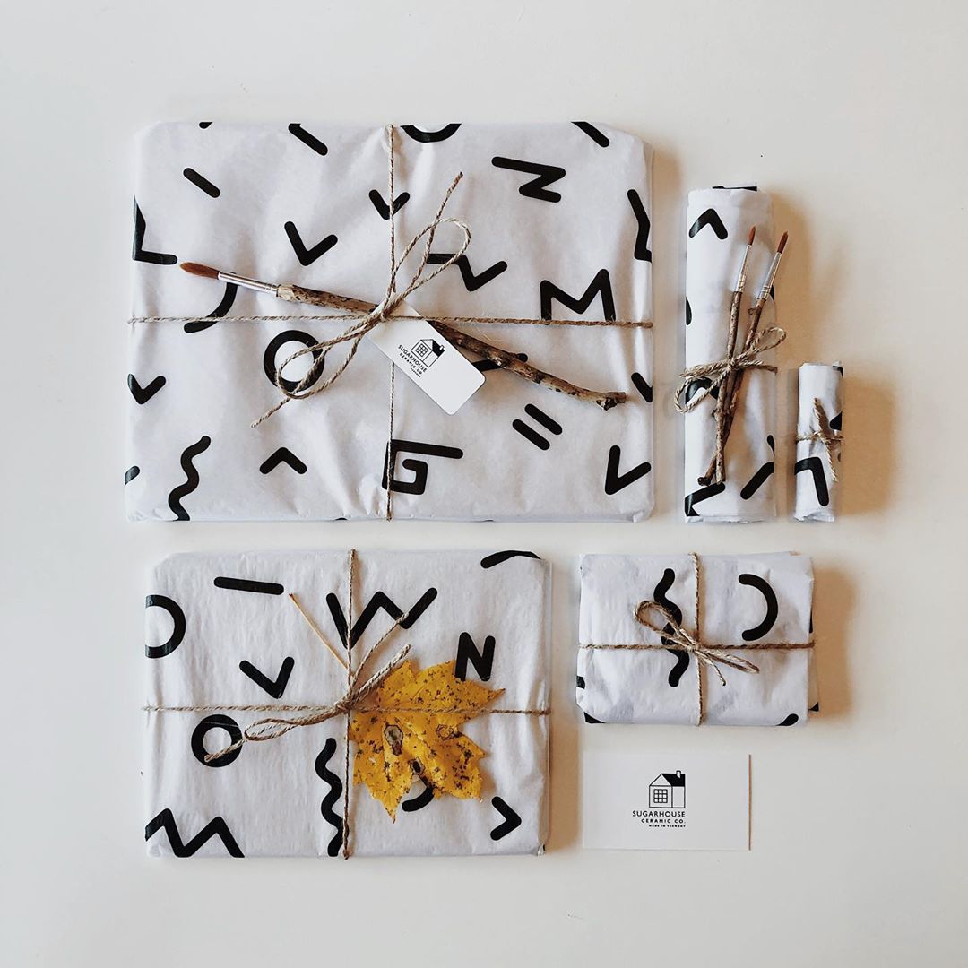
“Sugarhouse Ceramic Co. is born out of love, both for the art and for the founders’ love for each other. It amazes me how they’ve translated their brand with their tissue design! The simple black on white pattern is eye-catching and easily sticks in the mind. I like how they finished it up with some twine, a personalized card, and a maple leaf!” Mary Ann Torres, Marketing Assistant.
Design tip #3: ‘Less is more’ is certainly an apt saying comes to packaging design. Minimalist designs are polished, classy, and never run the risk of looking out of date. A more paired-back look also helps your goods to take center stage in your product photography!
Pretend Store (@pretendstore)
“I really like this design because of how they have used tissue paper as a medium to tell a branded story. Also, they have used white tissue very effectively as the base color to make the two-color design restriction go further!” Connor Archbold, Event Marketing Manager
Design tip #4: Using white in your custom tissue paper design is definitely one of our top design hacks. Because we classify white as a background color in two-color tissue designs, you can have three colors while only paying for two!
The Book Playbox (@thebookplaybox)
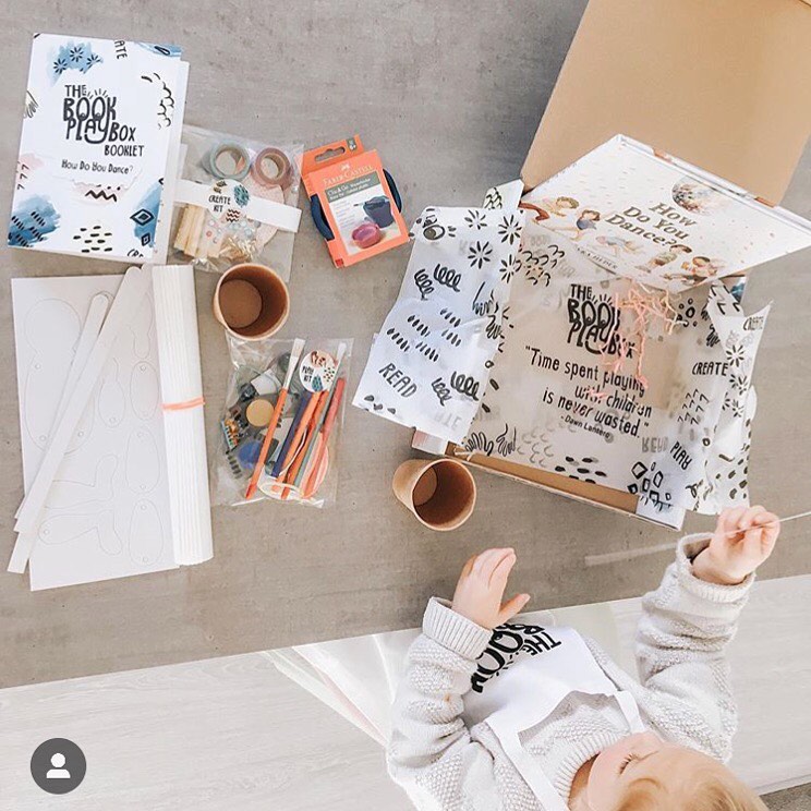
“The Book Playbox is a real standout for me, because they have let the usage conditions determine how to create the most engaging design. As a subscription box business, they have designed their tissue paper specifically to line the bottom of the box – so their customers get the extra surprise of a meaningful quote when they unpack the items! This makes for a more fun and memorable unboxing experience.” Tim Instone, Wholesale Manager
Design tip #5: How you plan on using your tissue paper is itself a very important design consideration. Playing around with the spatial constraints of your design, such as how patterns will blend together, can create all kinds of cool illusions and effects!
You can read our case study on The Book Playbox here.
Vermut Design (@vermutdesign)
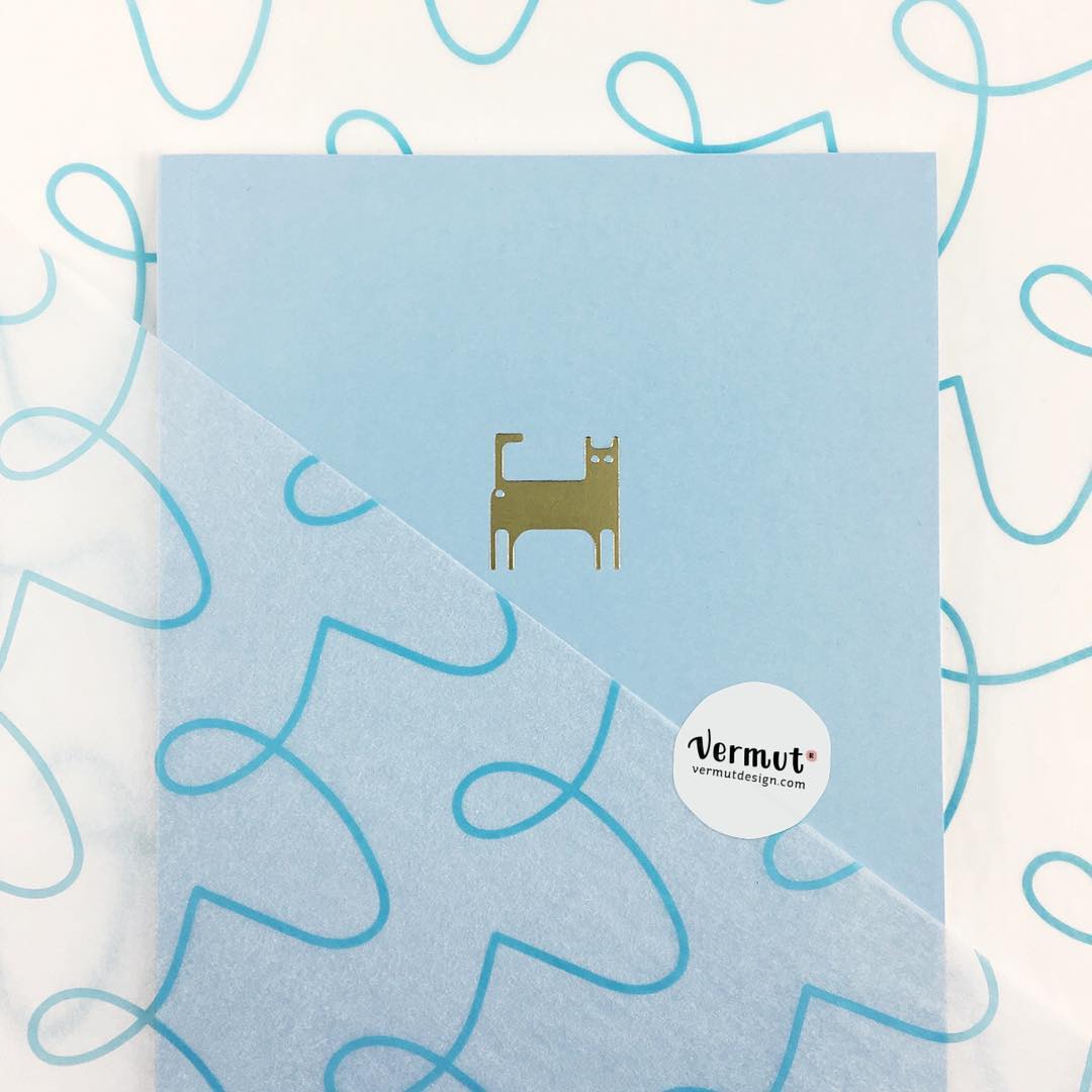
“Vermut Designs have used the translucency of our 17 GSM tissue really cleverly in their design. They have kept it nice and simple with the blue squiggle pattern, which allows their products to peek through in an appealing way. The overall effect is very modern and chic!” Josh Bowden, Co-founder.
Design tip #6: GSM (Grams per Square Meter) is an important decision in paper packaging, as this determines the overall look of your brand. A thinner tissue creates a more delicate and ethereal feel, while more vibrant colors will benefit from a higher GSM design, such as our 28 GSM paper.
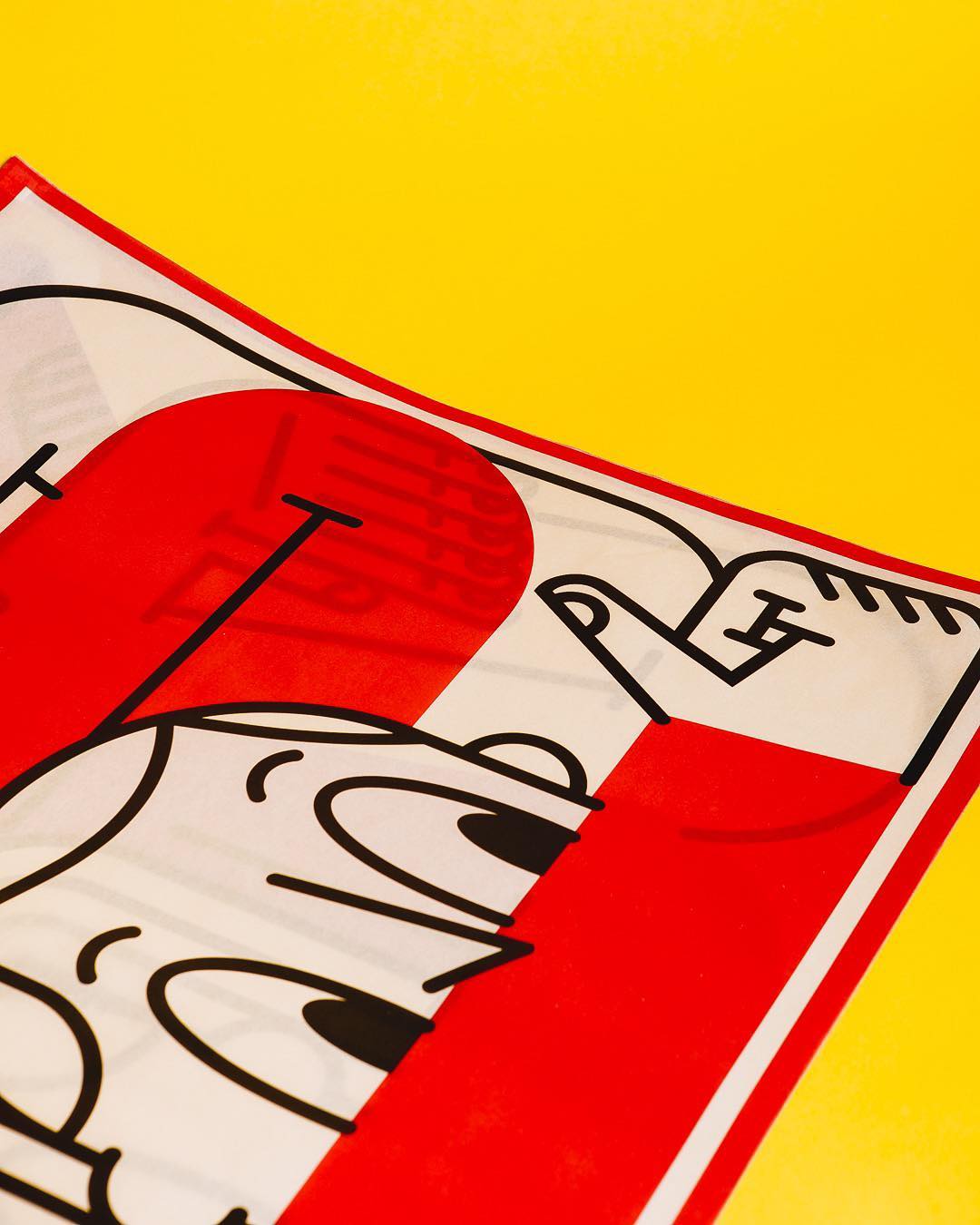
Ragon Dickard (@ragonia_)
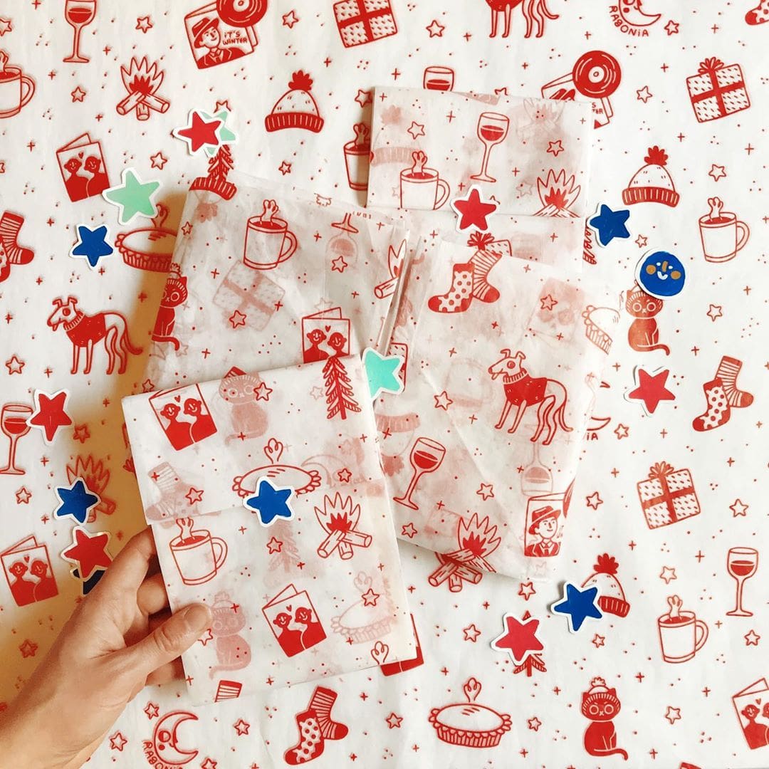
“I love dogs…and Christmas. So naturally, I love @Ragonia’s festive noissue tissue design (spot the cute dog in a sweater!) showcasing all the hallmarks of a white Christmas, Ragonia’s illustration style shines in this classic red and white print. Packaging is a great way to show off your brand’s personality; simply changing the colors of your regular brand packaging to some seasonal colors or incorporating some festive elements, is an easy way to update your packaging for different holidays or seasons.” Amanda Teo, Marketing Director
Design tip #7: Seasonal packaging designs are a fantastic way to update your brand imagery for key retail holidays. But this doesn’t have to mean channeling traditional symbolism, like snowflakes or candy canes – putting your own personal spin on festive events is a fantastic way to stand out and be unique!
Neva Hosking (@nevahosking)
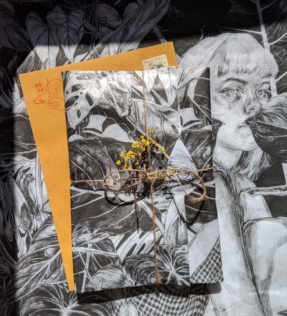
“Neva Hosking’s tissue design was a true standout for me! I love the fact that her design is simply one of her illustrations. I’ve been a big fan of her work for a while, and it would be so exciting to not only receive one of her illustrations, but also to be able to keep and reuse the tissue a piece of artwork in its own right!” Shannon Wray, Events and Sponsorship Coordinator.
Design tip #8: Artists and illustrators have a major source of design inspiration right at their fingertips – their creative work! Since customers already love their aesthetic, turning their own designs into custom packaging is a real value-added extra that makes receiving orders much more exciting.
Yali Ziv (@YALIZIV)
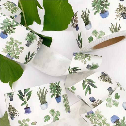
“I love this design by @yaliziv mostly because I’m all about little ways we can bring more plants into our everyday lives, as a gentle reminder that we are intricately connected to nature. This is a fun, playful design that can be used any time of the year, but could also be paired with certain colors of tissue or twine based on the season, to bring a holiday feel to it as well!” Abigail Davidson, PR Coordinator
Design #9: If you are searching for custom-branded packaging on a more limited budget, custom packing tape is a fabulous investment because it’s so versatile. It’s an easy way to liven up plain boxes or envelopes, creating a stronger brand presence at a low cost!
Violent Tinsel (@violent_tinsel)
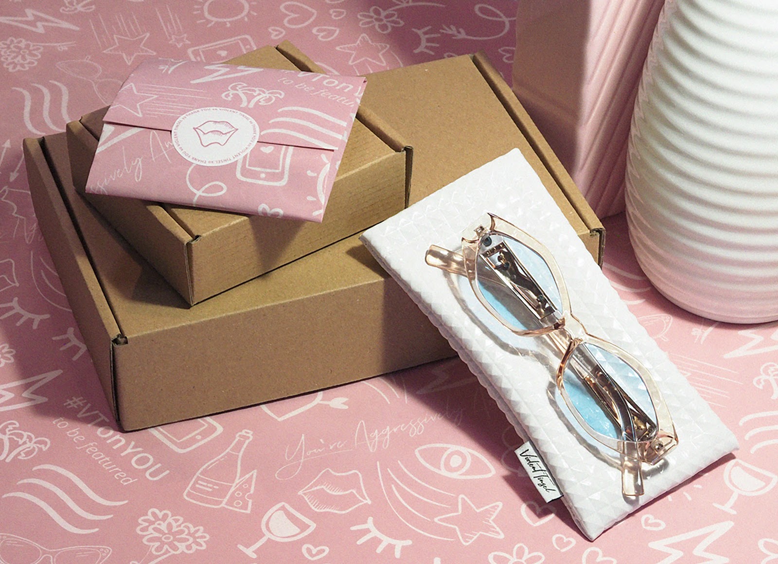
“Custom packaging is all about boosting your brand presence both online and offline, and Violent Tinsel score 10/10 for me. Their brand personality is clearly communicated – flirty, fun and feminine! You can tell that they have put so much thought into every element of their design – right down to the branded hashtags.” Maria Cenar, Customer Service Manager.
Design tip #10: For online brands especially, branded packaging is a brilliant post-purchase marketing tool. Incorporating key details into your packaging design, such as social media hashtags or website and store addresses, is a great way to provide ongoing touchpoints with your customer!
That’s a wrap from us! Thanks to everyone who was featured (and to everyone else whose fantastic packaging designs we admire throughout the year!) If you would like to see some more brilliant designs from our customers, check out our round-up of this year’s best festive designs!

