Kerry Lebensburger, chief revenue officer
Ashley Furniture Inds.
Somehow the answer to that question has to be technology.
One thing that seems to us very important to the in-store experience is replicating the kind of selection that you see on the web. The big-box stores all used to think they had the biggest selection until Amazon came along. What we have done each market is try to turn the Wondersign (Catalog Kiosk) into a better experience than you can get on the web.
We’re trying to at least match what we can offer on the web. We have 9,000 SKUs; when you walk into either a HomeStore or conventional dealer, nobody (can display) 9,000 SKUs. We keep expanding the Wondersign so you can see the entire breadth of what we can offer. We also have a version of a marketplace on it with third-party vendors who will ship direct.
We have things on it now like “Shop the room,” where you can look at pictures of product in the room and put all the pieces into your cart, pull out what you want or swap with what’s recommended.
The second thing we’re doing has to do with the importance of display in the store. For instance, we have two display concepts in addition to room packages and other (displays). One is The Cocktail Party, with a disco ball and the music and the whole bit, where we’re showing just the cocktail tables and then using technology to show all the other pieces. The consumer can use the kiosk themselves to see what the other pieces would look like. We show it at markets and try to get all of our dealers to put it in their stores. The idea is differentiate yourself from both the web and your other competitors. All the signage reminds you that there are end tables and sofa tables and wall units and desks and maybe even a dining room that matches. You go over to the kiosk and say, “I want No. 14,”and here come all the pieces that can go with the cocktail table.
Everybody knows that technology is very important to the consumer, (but) if you start putting controls on the furniture, you’ll be obsolete in two years. Alexa is going to recline your chair, but you still have to plug all this stuff in. You still need to charge, and you still need today’s kinds of ways to keep everything in place and in order.
So we’ve created a new display we’ll be showing for the first time at market in Las Vegas called “The Tech Tables.” Your tech tables can be anything from a dining room table that has storage as well as outlets in it to a lift-top cocktail to the tables that go next to your chairs and sofas. You’re going to have plugs, you’re going to have USB ports, you’re going to have lifts — all those kinds of functions that the consumer needs that is going to be relevant and still be relevant in two years.
Michael Amini, CEO
AICO
We look to provide a visual presentation that stimulates our customers and creates a shopping experience in their store.
The AICO line through collaboration with Nourison Rugs and Prestige Art along with the expansion of Michael Amini lighting, top of bed and accessories offers our customers an opportunity to increase their sales per square foot and also offer a professionally designed display. Paint colors, wall paper and flooring are all made available to our customers so that they also can recreate our showroom displays at the retail level.
In addition, we aim to save consumers shopping time through ease of selection.
Susie Wurster, marketing director
Elements International
Elements’ goal is to help our customers attract, educate and engage their consumers in conjunction with offering them space saving solutions to help drive sales per square foot.
We approach each market with the question: “If Elements was a retailer, what would our store look like?” and strive to launch new programs and categories that can easily be translated to a retailer’s floor with the same excitement that surrounds Elements program launches.
Dean Banks, senior vice president, sales, marketing, merchandising
A-America
We’ve been working with several dealers on signage for groups that need more than just POP. When there is a lot of function involved — as with our bi and tri-butterfly tables — the signage shows the function. The consumer simply doesn’t know if the salesman doesn’t show them.
The sales people love it, and we get requests from dealers every week to receive this. Right now we have it on 75 floors that are mostly smaller accounts across the country.
Tim Newlin, vice president, home furnishings
Flexsteel
We have an interactive Flexsteel Digital Kiosk and are working on brand development through in-store signage. The kiosk concept — which we started about six months ago and are showing again at the Las Vegas Market — is currently being tested in seven retailers.
It can be more than just a digital catalog in that you can put videos on it or get design inspiration that allows you to search by lifestyle presentation. That, in turn, allows you to click through to product.
We are also tracking how people interact with it, how long they are on it, where they are going and what do those journeys look like. Before we roll it out at the April High Point Market, we will have a sense of how users are interacting with this.
Charla Adams, brand marketing manager
Four Hands
Our showroom is a digital product catalog that extends the footprint of the retailer’s showroom into an online world. This customizable, easy-to-browse iPad kiosk allows the retailer to display its brand logo and product pricing while giving the shopper visibility to Four Hands product options, lifestyle photography and real-time inventory.
In placing this digital solution on the showroom floor, our customers are able to create new sales opportunities with an informative, engaging tool.
Angelo JR Marzilli, president
Decor-Rest Furniture
As we have a full range of items in our offering, we display them in a complete room setting approach. This method of presenting helps consumers imagine the entire room in their home complete.
From the largest item being the sofa in fabric, displaying the matching loveseat in leather along with a motion chair, (the complete room) easily allows consumers to decide which they prefer best, fabric, leather and motion options (with) one footprint targeting multiple consumers. Adding the coffee and end table, lamps, consoles and mirrors completes the room. (We keep) the program simple enough to select from yet enough options for it to feel flexible.
G Lipscomb, executive vice president of sales and marketing
Southern Motion
Last fall, we introduced the Relaxation Station, a program of diversified styles, mechanisms and fabrics to show the breadth of our recliner assortment including all the features and functions offered.
Our latest introduction, for example, the Enouvation wireless power device with powerful lithium batteries, is a heavy hitter and needs to be demonstrated on the floor. The universal rechargeable power pack unit discontinues charging once the battery is full, so it will not overcharge, adding to the battery life. The unit can easily power one to four motors and has a LED power indicator that displays the amount of charge in 25% increments and indicates when it’s time to charge, taking the guesswork out of your furniture’s battery life.
The Relaxation Station makes creating the perfect recliner easy as 1-2-3. First, you choose your recliner style. Second, choose your mechanism and any added features. Third, choose your cover from more than 350 fabrics and 40 leather options.
When we partnered with massage chair specialist Cozzia to introduce the SoCozi category, we knew it was imperative that retail stores have a way to showcase the features and benefits of SoCozi. We had to communicate the SoCozi experience to consumers and create an environment that showcases and entices consumers. We developed an incentive package that provides the retail store with an eye-catching display of large round decals, two portable walls and a large graphic — all representing the comfort and benefits of SoCozi.
Leather walls have become one of Southern Motion’s greatest selling tools ever for its retail customers. A recent promotion provided the customer with 20 genuine leather hides 8 to 10 feet long from an offering of leathers in 42 different colors and textures in a vintage industrial type display that’s an eye-catcher on the floor. The consumers can not only see and touch the hanging hides, but they can also drape them across Southern Motion’s leather sofa, sectionals, and recliners displayed nearby to complete the image of their possible new leather furniture selection.
Rodd Rafieha, senior vice president
Abbyson
We are working with many of our dealers to create enhanced marketing content, POPs and product tag solutions.
We have a variety of retailers featuring the Abbyson brand in their stores. For those dealers, we provide floor display mock ups that combine our imagery, content, product specs, our exclusive luxury cloud seating and our high quality construction in 3D image formatting.
We also provide hang-tags and POPs for all our motion groups that feature new technology or power features that are sometimes hard to explain by sales reps, or points that can easily be missed. On the flipside, we also do the same for our partners’ online platforms. We provide enhanced photography and content to our partners.
I truly believe the companies that provide the best store experiences coupled with enhanced web experiences are the ones that will last long term and continue to take more market share.
The new generation of shoppers needs both experiences in order to make the best buying decisions. They are very savvy shoppers.
Holly Lightfoot, director of merchandising
Parker House Furniture
We have recently hired a new marketing consultant and expanded our focus on in-store POP as well as improved catalog pages. Since Parker House has such a strong warehouse program, it is very important to have strong in-store access to our entire product line.
In our showroom, you can see the variety of POP available to our retailers: banners on stands, hanging banners, small hangtags and POP boards styled to fit in the TV space of an entertainment wall.
We have also expanded our availability of swatches for all of our various wood finishes, fabrics and leathers.
Along with physical in-store resources, we are also launching a new website. This will allow stores to have digital access to our entire product line with expanded features and details.
Luis Ruesga, CEO
Zuo
Understanding that each of our customers has their own unique approach to the marketplace, we want to make it easier to personalize their Zuo experience. This new shop-by-story concept helps our customers who know their brand or clients design direction, enabling them to save time when visiting tradeshows.
We are also making this shoppable vignette concept available to our retailers who want help establishing a merchandising plan.
Working with our in-house design team we will customize Zuo product vignettes, tailored to each brand’s perspective for use in their individual stores. Working to develop merchandising plans that speak to each retailer’s own sense of style and market helps us to support our retailers and increase everyone’s sales.
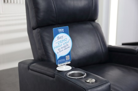
 Beyond Smart lets its Nighthawk recliner speak for itself, literally, through an app called Hello Coco. |
Rosary Tang, vice president of sales and marketing
Beyond Smart
We use video to help retailers understand our product features. For example, the Nighthawk recliner is controlled by an app called Hello Coco. We will put a POP hangtag on the arm to help educate in-store shoppers. Shoppers awaken the recliner by saying “Hello Coco.” Then, they are able to watch a live show.
Before the performance starts, the chair will say, “Thanks for your interest and watching this presentation. I’m Coco, if you forget my name or want to rename me, you can simply double tap the home button. Now I will demo all my functions for you.”
This saves the dealer’s time since they don’t need to explain the recliner to each individual customer, and it also makes the explanation more exciting. Meanwhile, it’s not only a live show, it also providers a great user guide for consumers.
Elizabeth Dell’Accio, vice president
Blu Sleep
Our colorful display and foams attract the eye of customers and help start a conversation between the RSAs and the customers. Our graphics clearly define features and benefits and are easy for the customer to understand.
From there the “experience” is really when the customer lays on one of our pillows and enjoys the comfort and support they provide.
Stephen Kuhl, CEO and co-founder
Burrow
We designed Burrow House, our flagship location in SoHo, to be more than just a retail store. We want it to be a place where people can come, relax and create a deeper connection with Burrow beyond just shopping for product.
For instance, we’ve been able to cultivate this unique experience is by hosting weekly events in the store. From craft clubs and movie nights to intimate concerts and panel discussions with like-minded brands, we curate experiences that provide value to our customers, all from the comfort of our living room.
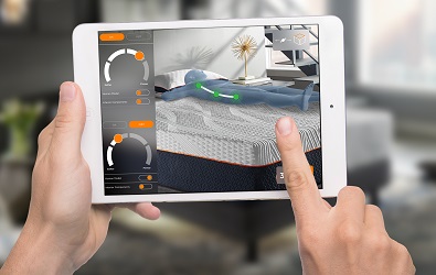
 ISense Sleep’s new app allows RSAs to help consumers see the technology and benefits inside the mattress. |
Paul Longman, CEO
iSense Sleep
When iSense Sleep first launched, we introduced consumers to our brand by exploring inside the bed technology with our unique virtual reality sales experience. This year, we wanted to continue to seek out new and exciting ways to showcase our technology. Our goal is to create an experience that’s easy for the RSA (to use) while educating the consumer and is seamless to the sales process.
To meet all of those needs, we’ve worked with a local tech company to create an interactive augmented reality experience that allows consumers to not only peel back the layers of the mattress to see how our technology works, but also to visualize how controlling their individual comfort impacts spinal alignment.
We introduced an app that co-exists on the tablets provided to the RSAs, as part of the selling toolbox that controls the bed as they take the customer thru their journey, making for a seamless sales experience.
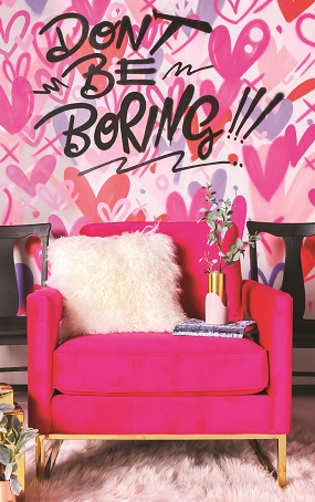
 Tov Furniture vignettes are created to be Instagramable. |
Bruce Krinsky, chief problem solver
Tov Furniture
We rock by the mantra “don’t be boring.” At Tov, we focus everything we do though the lens of our target audience, which includes how we display our merchandise. It’s not about the furniture; it’s about how the furnishings make you feel. It is emotionally and sensory driven.
We use color, shape, and cuteness to stimulate the same kind of exuberance as a kid in a candy store. We even include a fragrance and a soundtrack to lift spirits and bring a smile. Furniture shopping should not be transactional. … We sell furnishings, but what we truly deliver is happiness, love and entertainment.
To achieve this goal, the in-store experience begins in the mind of the consumer before she ever pulls into the parking lot. … We touch our prospects at least a couple of times a week on social media.
Our customer isn’t afraid of change. She embraces it and expects to replace her sofa every three to five years. Our images show her what her home could be with minimal cost and effort.
We cajole and incentivize our dealers to display our furniture in curated settings. A Tov display looks like a pop-up shop with flair, fleek and panache. It is an oasis in a desert of beige, brown and boring. We are constantly studying food, fashion, texture, cosmetic, destination, wedding and celebrity/influencer trends. Our all-female design team brings nouveau to the marketplace in a way that is relevant, meaningful and exciting to an urban 25- to 34-year-old woman.
Floor coverings, art, accessories and lighting complement furniture and make it the star. Tov designs its showrooms and displays in three dimensions. Items are often showcased on multiple levels for both visual appeal and to maximize return on investment.
 Lisa Cody, vice president of marketing
Twin Star Home
Twin Star Home is innovating as well as using some traditional ways to create a better in-store experience.
We know that consumers are pushed for time so they skim the content. For this reason we keep our messaging concise and use easily digestible bites of information that are relevant and compelling. To aid consumers visiting brick-and-mortar stores, we attach the POP merchandising physically to the product so the key points are right there and are easy to understand. For example, we will put a tent card on a TV stand to share information, or put a static cling on the fireplace inserts or furniture. For consumers who don’t have time to read brochures, we’ll provide content in the form of an infographic instead.
We shoot videos in the showroom to use as training videos for RSAs, and the content often serves double duty as an informational video that can run in-store. We know most consumers respond well to infotainment, so we add music or bits of humor to the videos to keep consumers interested.
RSAs need to be knowledgeable about the product, so we keep in touch with our dealers to find out what type of information they need, as well as what form they prefer such as video vs. printed materials.
We have outlined four key consumer types: The on-the-go realists, premium stylers, social mood setters and cozy efficiency-anados. This enables us to personalize the showroom to each of these groups in order to make the in-store experience more enjoyable.
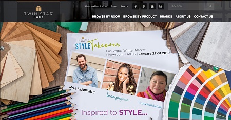
We are also partnering with designers Max Humphrey, Breegan Jane and Jeanne Chung to create better in-store experiences for customers (and) … to bring their fresh perspectives on creating innovative focal points in our showroom to highlight our newest products. Our goal is to inspire and help retailers to be able to recreate those looks.

