Verity
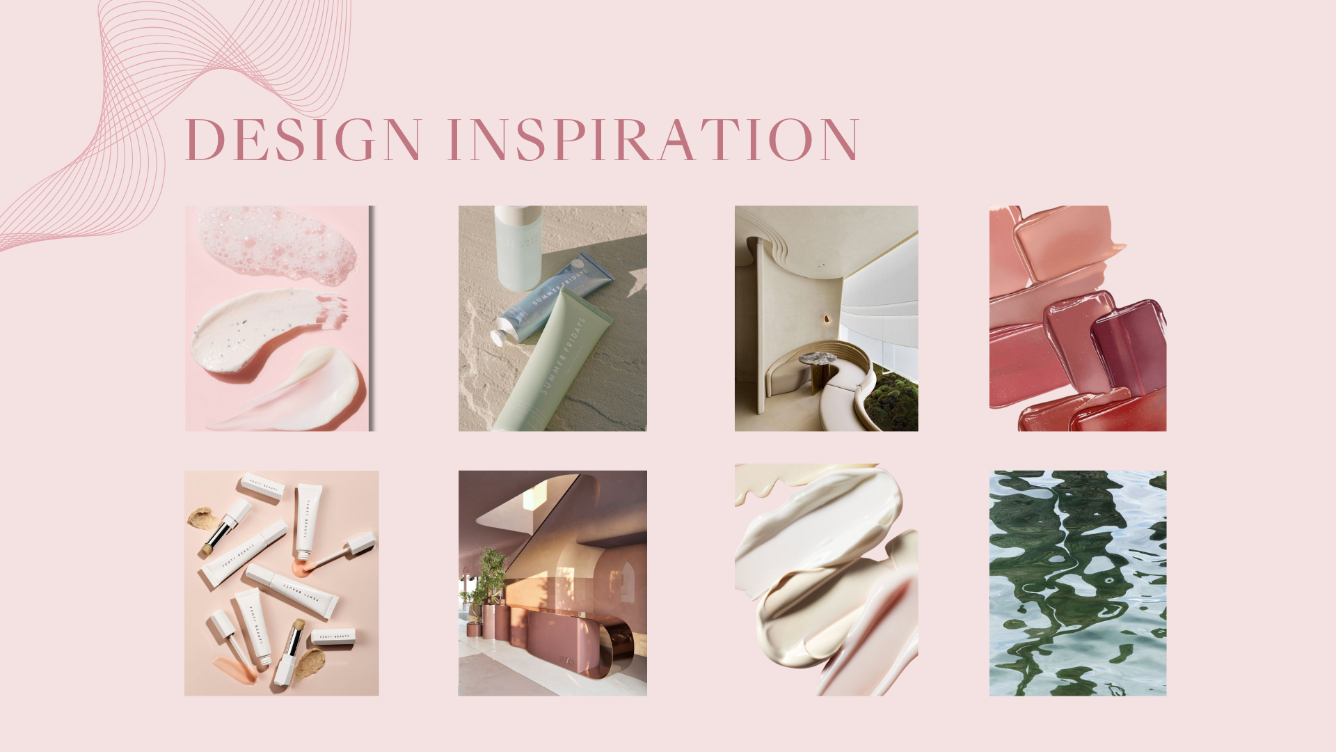
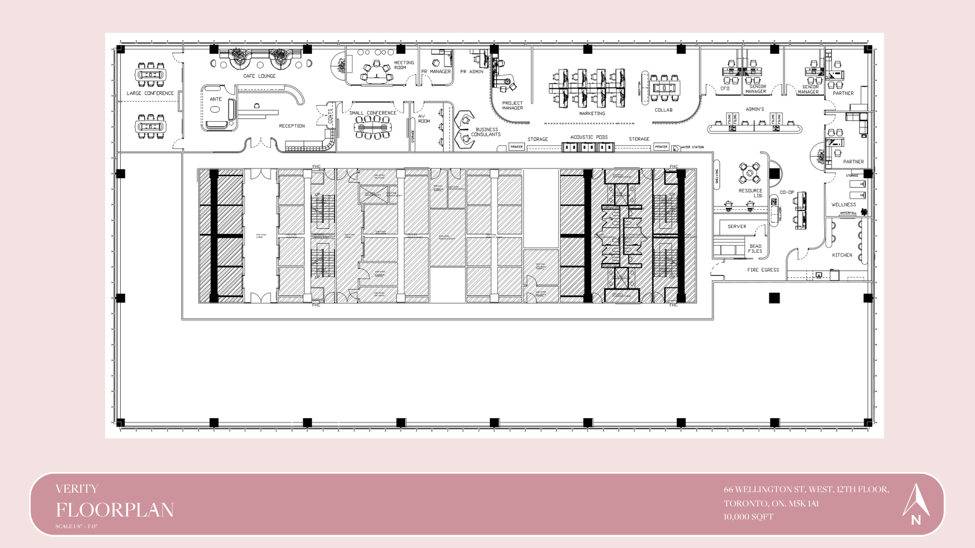
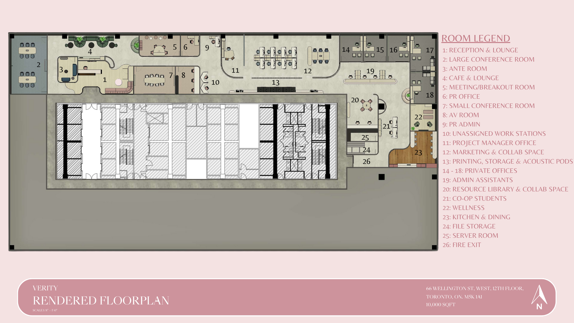
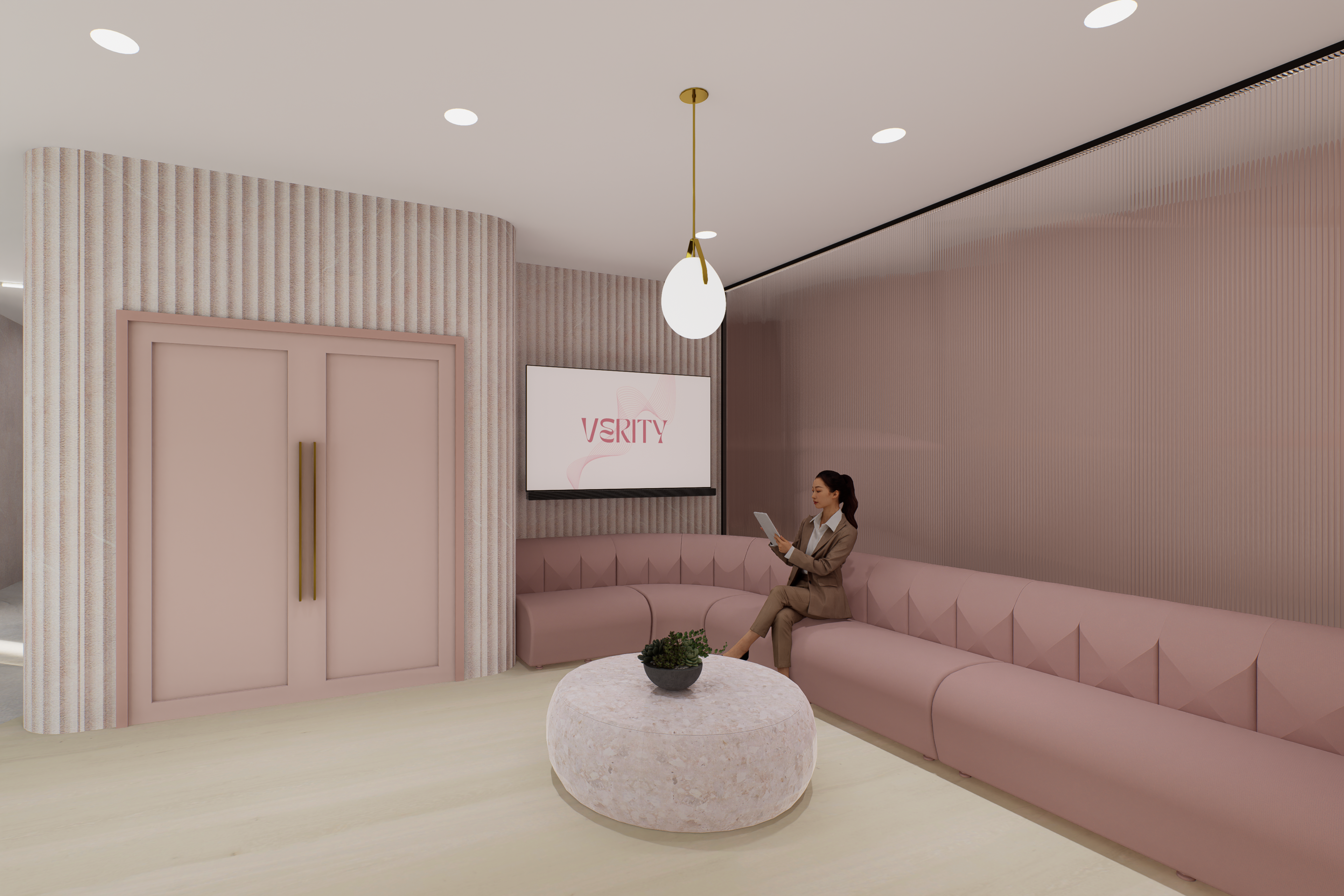
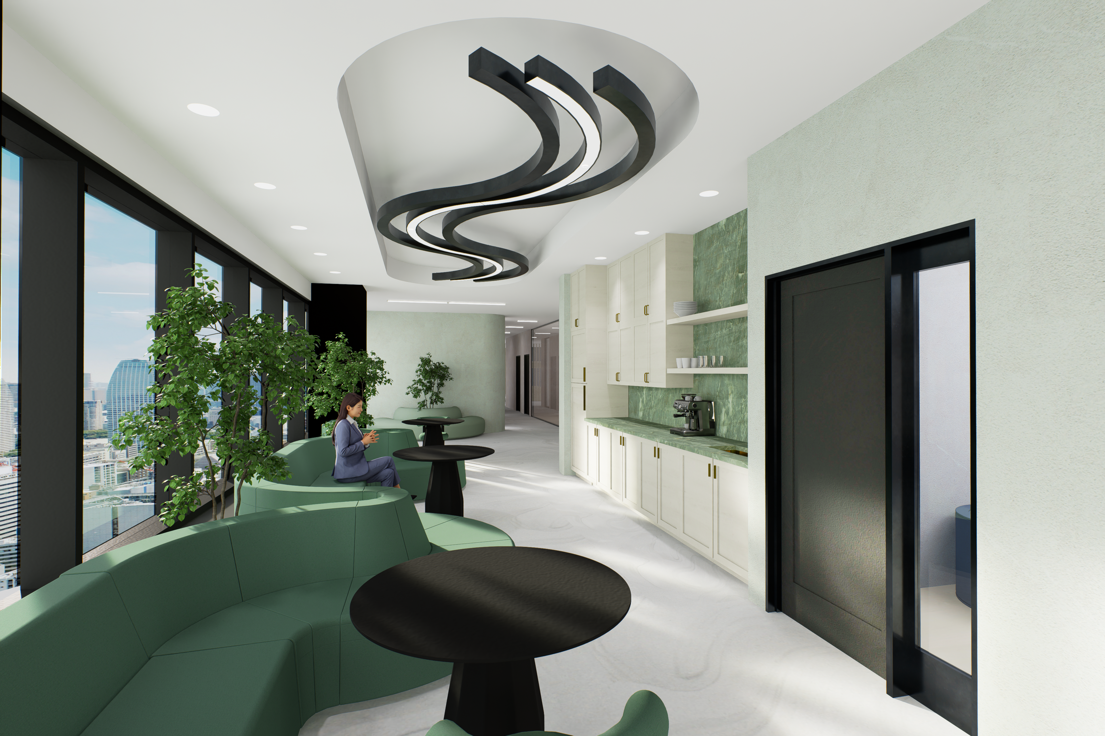
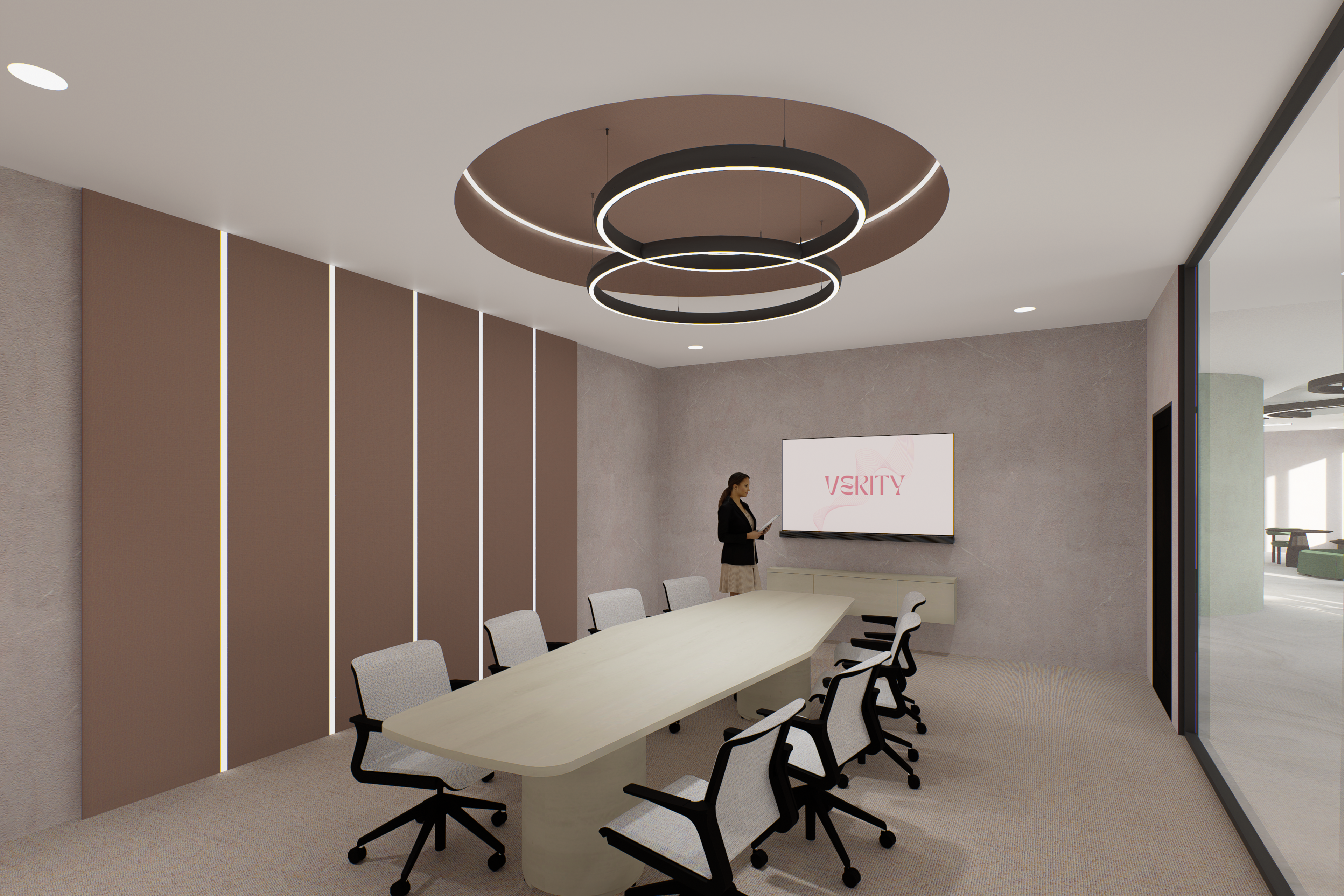
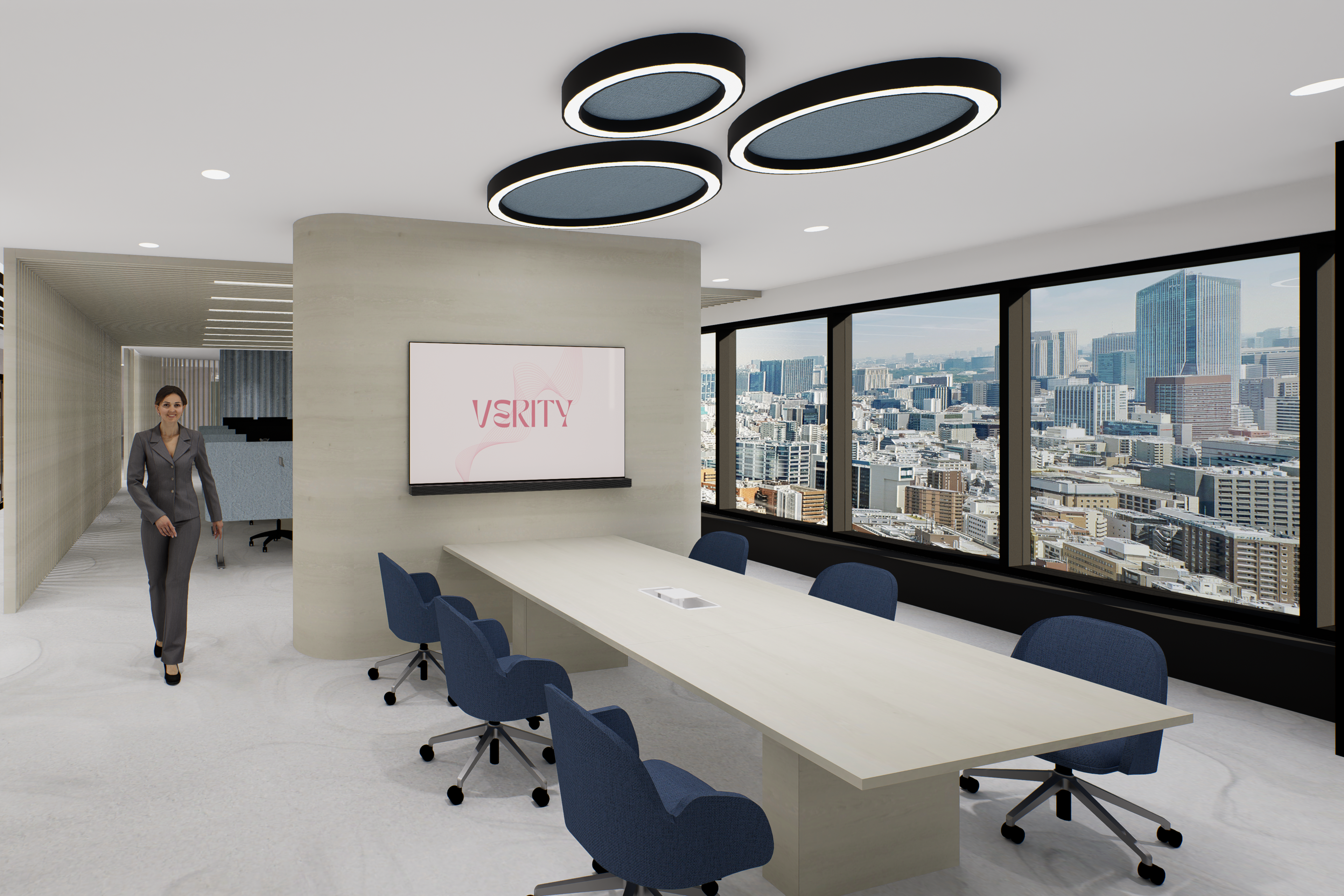
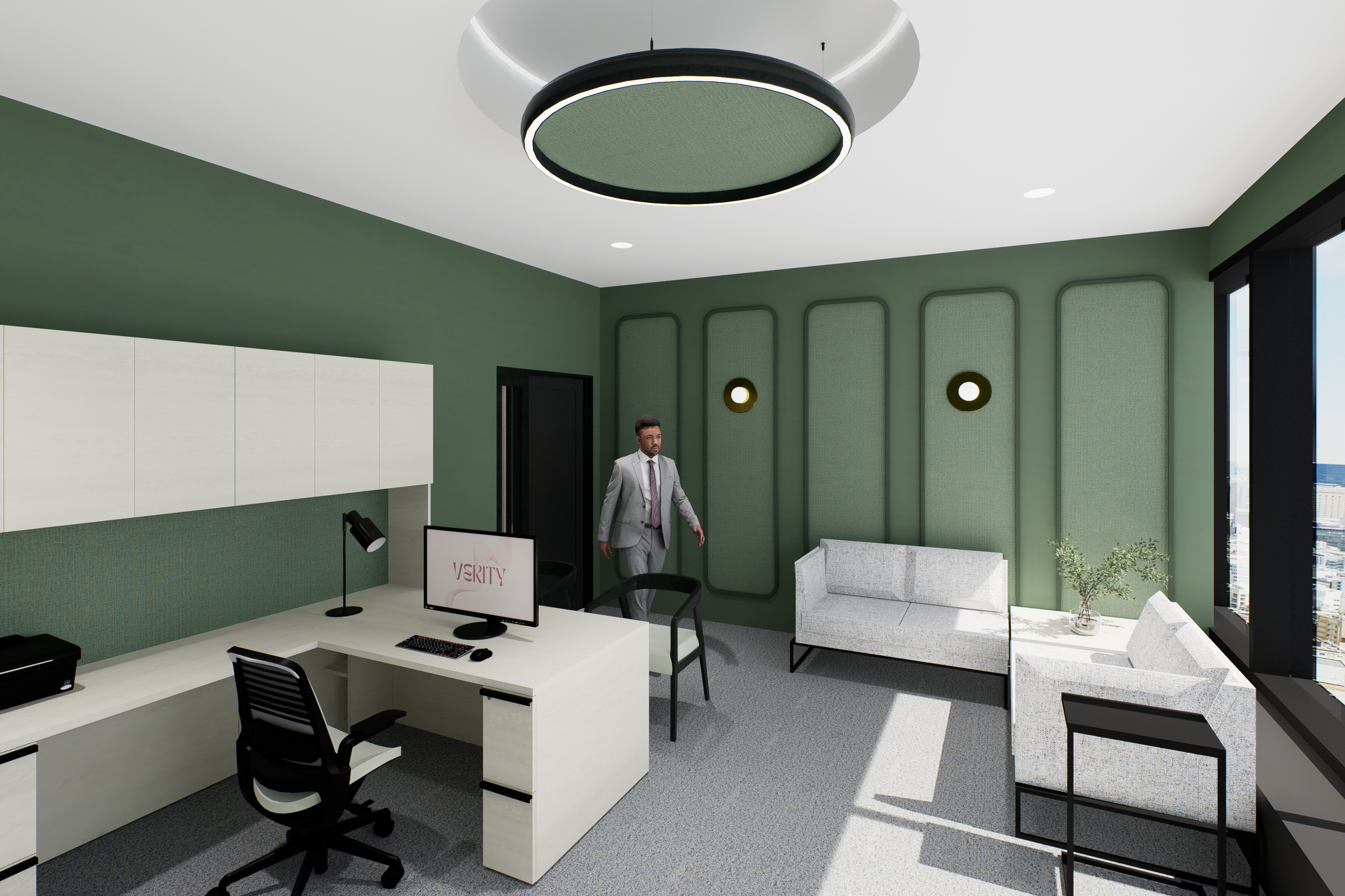
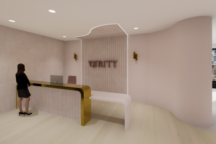
Verity is an advertising firm that specializes in representing inclusive and socially responsible makeup and skincare brands. As a firm, they believe that makeup and skincare is about experimenting with different products, colours and shades to find what works best for each individual. Makeup and skincare is for everyone to enjoy and we wanted to highlight this through a colourful and inviting office design. Our design incorporates soft curves to represent the blending techniques used in the application of makeup. These curves also represent how makeup and skincare is not a linear process, as each individual has their own personal preferences that are ever changing.
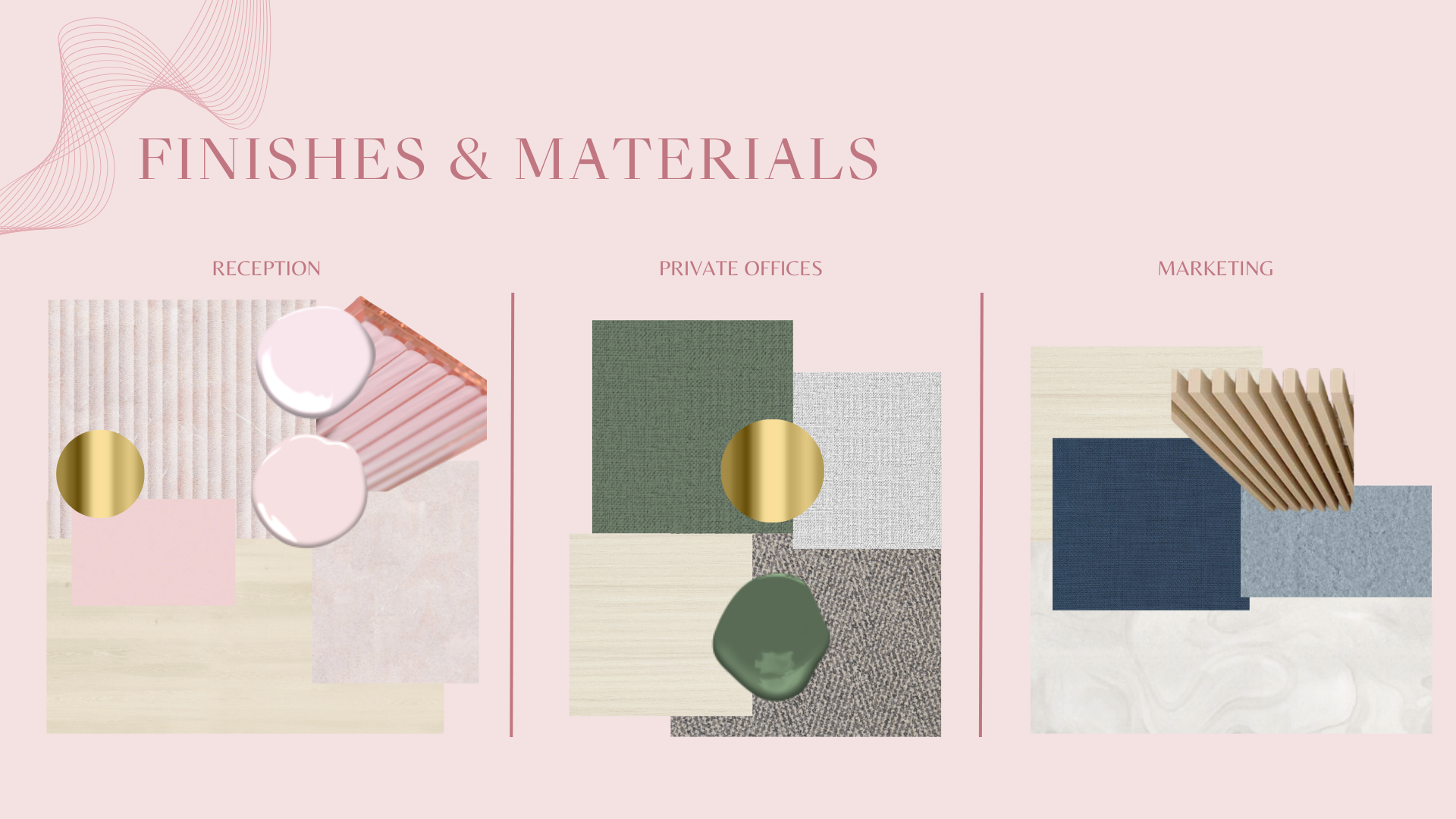
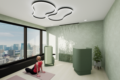
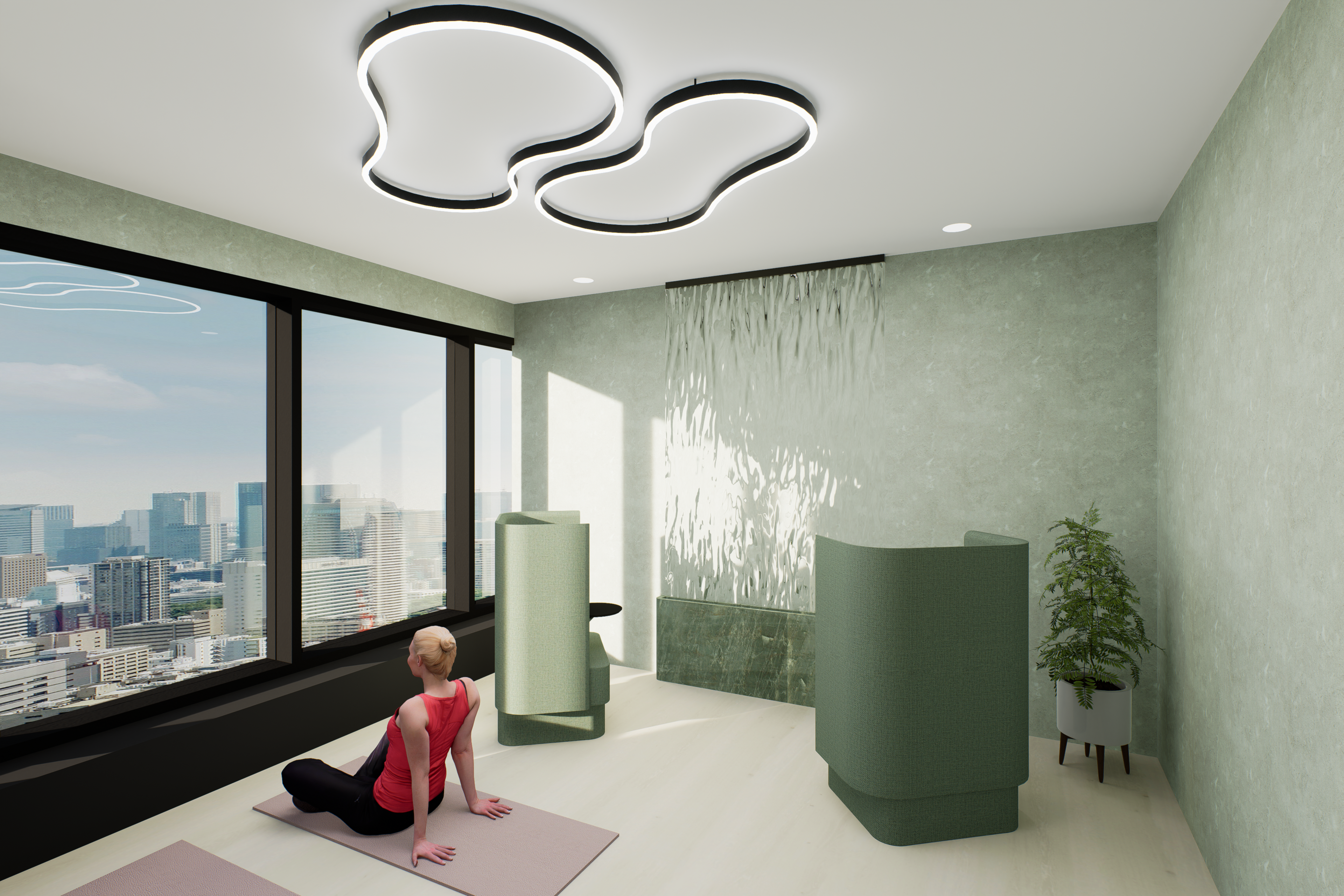
When designing Verity, we wanted to create an energetic and inviting office space that has a direct impact on the wellbeing of staff and clients. By utilizing the principles of colour theory and selecting exciting colours such as pinks, blues and greens, we were able to design an office that not only aligns with Verity’s branding but also creates a positive corporate environment. These colours are proven to increase focus and productivity, reduce feelings of fatigue and stress, and promote creativity and excitement within the workplace. We chose to integrate these colours within our design by creating monochromatic spaces, which were inspired by the monochrome gradients often found in makeup palettes, such as eyeshadows or blush. These spaces also create a sense of cohesion and unity throughout our office, and contributes to a visually aesthetic and calming work environment. Above all, our design of Verity showcases how the workplace can be fun, bright, exciting and colourful. It demonstrates that colour and environment are important factors in promoting focus and productivity among staff, and illustrates that we can motivate and inspire people with thoughtful and lively designs.
×
![]()
×
Reason :


