 To compete with the speed and convenience of shopping online, many retailers have previously sought to speed up and shorten the brick-and-mortar shopping experience. But in the world of online shopping, retail’s competitive advantage is the in-store experience.
Despite the ease of shopping online, customers who head to a physical store are looking for something else. That’s why a leisurely experience (that facilitates browsing) generally leads to higher sales. As a retailer, the longer you can keep customers in your store, the more you can boost your bottom line.
But short of building a maze that traps customers in an endless loop, how can you keep them walking around your store?
Creating a predetermined path for customers to follow through your store can help encourage browsing and keep them in your store longer. Using interior design principles and a tailored store layout, you can set out a path through your store that keeps customers around and encourages them to buy more.
Not sure how to create a path that suits your store? Here, we’ll walk you through the process of building a path and illustrate some useful examples to help you get started.
How to Create a Path Through Your Store
By pulling from both interior design best practices and the psychology of shopping, you can design a specific route for customers to take through your store. The most effective path plays to the existing habits of shoppers to make it feel completely natural to walk the path you’ve set.
To capture that feeling, you need to follow the basics first.
Start to the Right and Go Counter-Clockwise
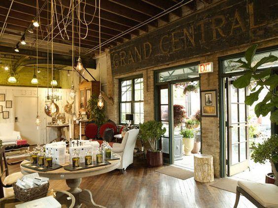
When getting customers to follow a predetermined path, your work begins from the moment they walk into your store. Instead of working against shoppers’ natural tendencies, work with them by beginning the path to the right of the door.
In North America, the vast majority of customers unconsciously look to the right first. That’s why the area directly to the right of the entrance provides your first opportunity to capture shopper attention. Place high-impact, eye-catching displays in this space.
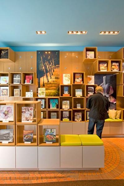
You can also create a “power wall” on the right-hand side of your store. This hot spot is the perfect space for in-demand products and seasonal items.
Use a Loop (or Racetrack) Design
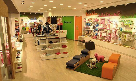
Once customers are drawn to the right of your store, you want to keep them walking the path you set. That means your store (and path) should be laid out in a way that feels natural. Zig-zagging up and down aisles or haphazardly from one display to the next doesn’t feel natural for most shoppers. That’s why a loop (sometimes called racetrack) design is the best option.
By looping counter-clockwise along the back and sides of your space, you can lead customers past high-demand, high-profit, and impulse products — and customers can get the lay of the land before diving into the center portion of your store.
Draw a Path on the Floor (Literally)

Most of the steps you take to create a path are subtle and play to customers’ unconscious tendencies. There’s one trick of the trade that’s a little more conspicuous — a literal path on the floor.
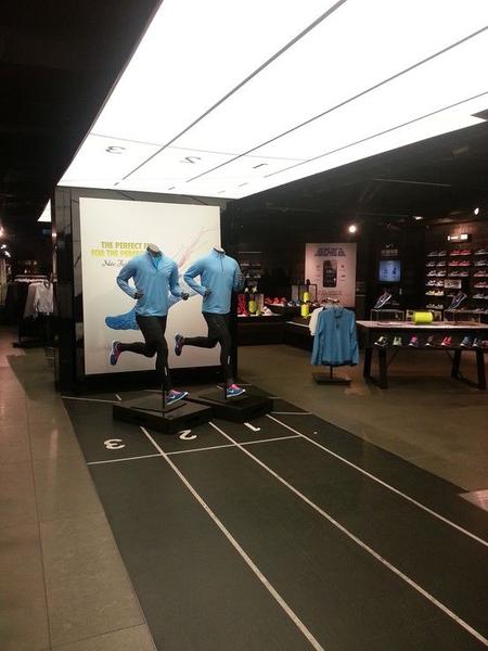
As humans, we subconsciously follow lines and arrows. Using a different color, texture, or pattern to call out the path you want customers to follow is a potent way to get them to follow along.
And, as you can see from the above examples, your path doesn’t need to be straightforward arrows or boring lines. Be creative. A playful faux bike path or running lane can go a long way to keep customers on your designed path while still staying on brand with your design.
Use the Path to Your Advantage
Drawing a path for customers to follow through your store is all well and good. But the end game is to use that path to your advantage: to entice customers to buy and spend more. Here are a few ways to make the most of the path you’ve set.
Organize Merchandise to Accommodate Browsing
The main goal of your path is to guide customers through your store and past everything you have to offer. To maximize that path, your displays should be designed for browsing shoppers. High-demand, anchor items should always be displayed prominently, so customers with specific buying intent can easily find what they’re looking for.
The space around these high-impact displays is ideal for additional items customers may want to buy in addition to the primary item. Think about displays in home goods and decor departments — you may have gone in for a sofa but that accent chair matches perfectly!
Slow Customers Down With Speed Bumps
You want customers to follow the path, but not by making a beeline straight to the end. Along the way, slow them down with speed bumps — eye-catching displays that cause shoppers to pause.
To give shoppers a visual break and encourage impulse buys, create a display distinct from the aisles or shelving along the wall.
Fill the display with products unique from those on the shelves, that still fit within the theme of the space. Consider seasonal or special edition items. For example, to break up a section with women’s tops, create a speed bump with matching scarves during the winter. When the season changes, you might display sunglasses here.
Don’t Overwhelm Customers
In order for a path to help you keep customers in-store and get them to spend more, they have to be in the right mindset to continue shopping. Getting customers in the right mood to spend entails several things we’ll cover later on — the most important thing to remember is to avoid overwhelming customers.
If you’ve ever gotten lost in a Bed Bath & Beyond, you know this feeling. A few ways to keep customers from feeling overwhelmed:
- Ensure the entrance (and exit) are always within sight,
- Avoid overly tall or floor-to-ceiling shelving,
- Leave plenty of personal space, and
- Employ ample, descriptive signage to help shoppers with specific buying intent find what they’re looking for.
Examples of Great Retail Paths
Creating a path in your retail store isn’t a new tactic, but it can be incredibly effective at keeping customers in-store and getting them to buy more. That’s why we often see powerhouse retailers employ this strategy, too. Let’s take a look at a few case studies to see how successful retail paths work in the wild.
IKEA
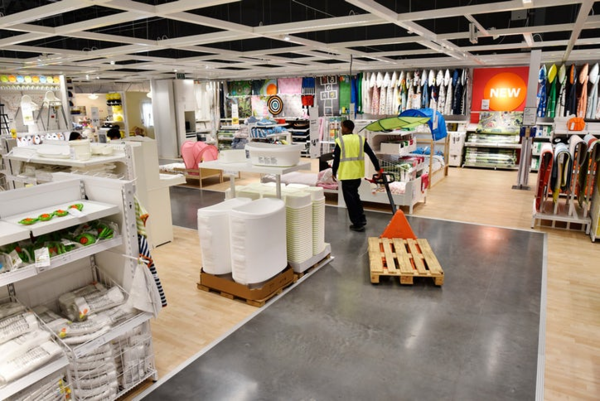 Furniture and home goods giant IKEA champions the retail store path. Shopping at IKEA carries its own unique experience — so much so that it’s become something of a cultural rite of passage.
IKEA organizes their store into collections instead of just departments. Customers walk through mock-ups of kitchens, living rooms, bedrooms, etc. as opposed to rows of chairs or islands. IKEA also employs that simplest of tools: a literal path along the floor. Customers follow along the path, with the option to diverge into collections that interest them.
Francesca’s
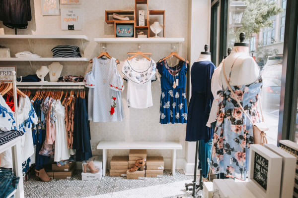 Francesca’s stores are small and usually consist of a loop around the outside wall and a few table displays in the middle. If you’ve ever been in one, you know it’s easy to get lost browsing for much longer than the store’s size might imply.
Francesca’s does this primarily with the way merchandise is organized. A power wall of seasonal styles greets customers to the right of the entrance. The rest of the path is organized by style and color, encouraging customers to keep walking. Francesca’s also encourages customers to browse by displaying add-on items (like shoes, bags, and jewelry) above and below apparel, so shoppers can visually create a whole outfit.
HomeGoods
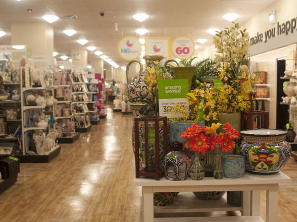 The aptly-named HomeGoods is another champion of the retail path. Stores are organized with an exterior loop that takes customers past high-ticket items like furniture and lighting. Smaller decor items are usually organized as a grid in the middle.
What makes HomeGoods so dangerous (for habitual browsers like me) is their “speed bump” displays. Along the outside path, they create eye-catching displays that draw the customer in with bright, seasonal, and catch-all items like candles or flower arrangements.
Keep Customers In-Store Longer
We talked earlier about slowing customers down while they walk your store’s path. Speed bumps and organization that favors browsing behavior are your friends here — but there are a few other steps you can take to encourage shoppers to hang out for a while.
Keep It Comfortable
No matter how interesting your product displays are, there are other factors that might cause shoppers to run for the hills. That’s why it’s important to ensure your store is comfortable for customers overall. What does that entail?
- Maintain a comfortable temperature,
- Organize for ample personal space,
- Play mellow, unobtrusive music, and
- Create a lounge area for shoppers to take a break along the way.
Turn Shopping Into an Experience
In an effort to further differentiate retail stores from the speed and convenience of online shopping, some retailers have pushed hard in the other direction — turning in-store shopping into its own experience. Consider some of these examples:
- Sephora offers free facials in-store to pamper customers, teach them how to use Sephora products, and give them the opportunity to sample before they buy.
- Urban Outfitters redesigned their stores to give every outlet a unique flair, so shopping at each location is its own experience.
- Untuckit stores host mini-events where customers are encouraged to come in, have a shot of whiskey, and chat with store workers.
Show Customers the Way
Creating a designated path through your retail store has all kinds of benefits — from keeping customers in-store longer to ensuring they walk by high-demand items. And we know that the longer shoppers spend in your store, the more likely they are to buy and to spend more.
That’s why creating a path for customers to follow is well worth the investment.

