WHAT IS IT?
Virtual reality and augmented reality are gradually finding their way into retail, and companies like Ikea are beginning to realise just how much they can add to the customer experience.
For retailers who can offer a huge range of options but rely on massive display units, virtual tools offer a perfect solution. They allow customers to get an in-depth idea of what they’re buying, without having to travel to a giant warehouse and explore thousands of items.
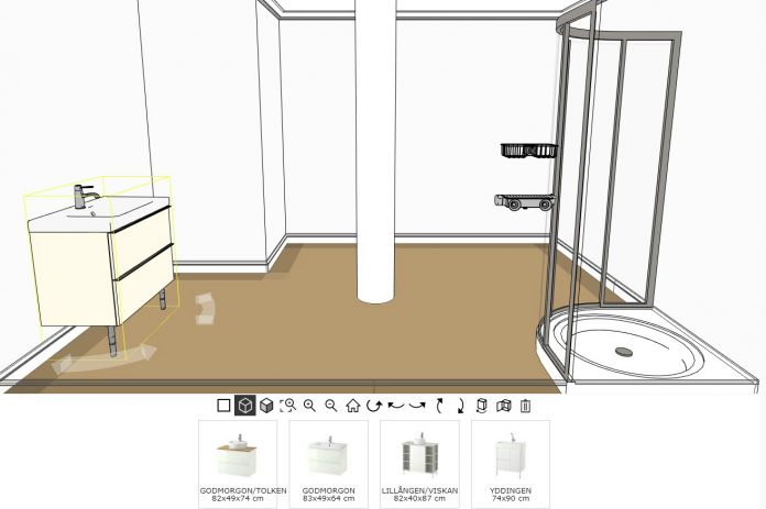
Ikea’s home planner app offers customers the ability to experience Ikea’s products in a 3D virtual rendering which can be mapped to any room in their own home, from their own home.
It is available online, without the need to download anything, and runs on almost all operating systems. Moreover, its simplicity and intuitive design means just about any computer literate person can use it.
HOW DOES IT WORK?
The tool is available through Ikea’s website in the “Planning Tools” tab. Simply click on the “Kitchen Planner” to get started.
Once you open Ikea’s 3D kitchen planner, you’ll be met with a screen which allows you to get designing straight away or create an account.
Although you’re able to print off a list of all the items you’ve selected in your design without creating an account, by creating one you’ll be able to save your design for future reference, and log into instore for some staff guidance with your design.
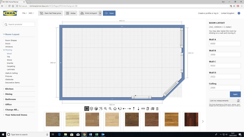
First things first you have to lay out the dimensions of your room. There are some basic room shapes available at the bottom to help you get started, and an option to input measurements to determine the dimensions is always available in the side bar.
If you haven’t got the time or are just having a play around, you can simply drag the walls to make it bigger and smaller as you design.

A range of windows, doors and obstacles like posts and partition walls can put places in your virtual room, which can be customised to in-depth details to create the most accurate representation of your home possible.
When an item is selected, you can simply drag and drop them onto walls, and alter things like door frame colour, carpet or laminate colour, wall paper and even the view out your windows.
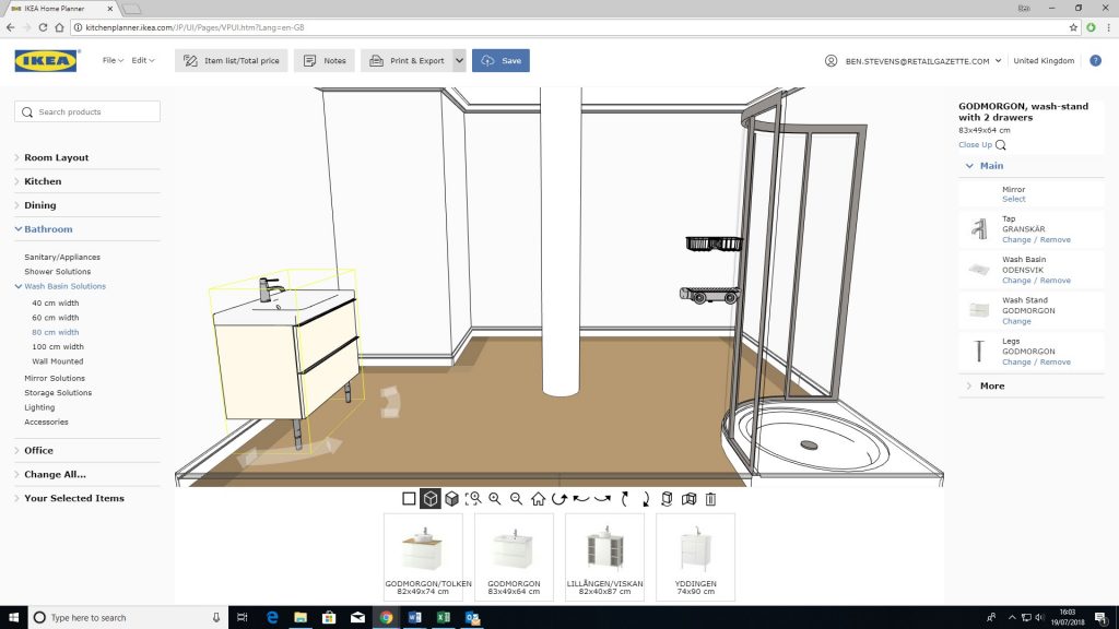
There are three views available, one overhead with a grid like an architect would use to plan, then two 3D view modes, one rendered with simple lines, another rendered with full detail.
You can then start adding furniture from the side tab, which are split into sections including bathroom, kitchen, dining and office.
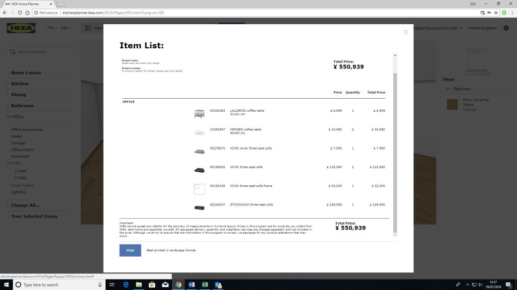
Each tab will offer you a list of 3D rendered items from Ikea’s catalogue which you can customise however you like.
Once you have all the items you want in place, you can capture and print renders of your virtual room. Each item you have selected will appear in a list alongside its price and ID number.
You can then either shop for these items online or use the list and render to guide your shop in-store with the help of staff.
HOW WELL DOES IT WORK?
To start with the tool seems like a lot of fun. Creating a virtual version of the room you’re sitting in is strangely satisfying and tweaking small details like the colour of the doorknob or size of the window sparks your creativity.
Although some of the options are incredibly detailed, like the addition of plumbing and gas pipes, the basic layout of the room seems to be limited to the pre-sets given. This means if you have various cubby holes or extra angles you’ll find it hard to create an accurate model.
The fun really starts when you start adding items from Ikea’s catalogue, at least it would do if it wasn’t dogged by bugs.
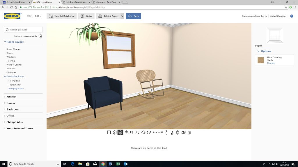
Adding items for the most part is easy, you simply click on it and it will appear in the room for you to move and rotate as you see fit. You can customise it on the right bar and things like chests of draws will snap to the wall without your input. The 3D renders are accurate and give a great impression of what they’d look like in reality.
However, maybe one in three of these items seem to work. While testing this programme, whole sections of items would simply not appear in the room when selected. Some simply refused to appear, others would fail to appear but show up on the item list anyway.
According to Ikea’s website, the PC I was using was up to the specifications needed for the programme, and there seemed to be no error message or explanation as to why they would not appear.
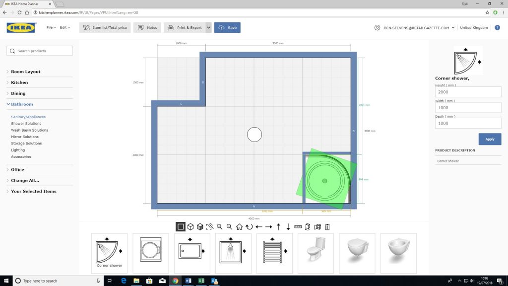
Restarting the programme also seemed to have no effect, some items worked and others didn’t. Thankfully, I had saved the design so could return to it, because it crashed and became unusable numerous times.
When it worked, the process was fairly intuitive and easy to work out without instructions, which is lucky as there seemed to be no guide or instructions.
This wasn’t so true when you view the room in 3D. The movement seemed clunky and unlike other virtual room apps where you’re able to view it as if you were in the room walking around, this only offered the option to view it from a more distant perspective.
SHOULD I TRY IT?
This app started out as a lot of fun, and for retailers, customers having a good time often leads to sales.
However, after spending a lot of time creating a room that was an exact representation of your own at home, the amount of bugs when it came to adding the furniture was frustrating.
For users with very high-spec computers, the experience may be more fruitful, but for the average home user with a laptop designed for browsing these pretty major flaws may also afflict their experience.
That said, if you are interested in the experience virtual and augmented reality can bring, its worth a try to glimpse what will undoubtedly soon be a staple part of the furniture shopping experience.
Click here to sign up to Retail Gazette‘s free daily email newsletter

