It’s no secret that retail is led by experience these days. Consumers don’t only want to shop, they want to come away from a store feeling enriched, uplifted and impressed.
For major department store or apparel retailers, this means “creating richer experiential layers,” according to Dawn Clark, SVP Store Design, Architecture & Construction, Nordstrom (Seattle). “We’ve incorporated elements like ‘moving wallpaper,’ which sets a mood rather than a brand,” she says. “A wander through the store should feel like a walk in the forest, where there is variability and consistency, with fixtures seamlessly integrated. All of the other layers are important too – natural lighting, air quality, sound, organization, clarity of color and composition.”
The next evolution is smart tech and augmented reality (AR) that could potentially alter how consumers perceive fixtures. And Nordstrom isn’t alone in its thinking. Even in food retail and grocery, the method of delivery may be different, but the end goal is the same: making shopping an experience.
“The main trend we’re working on is mobility within fixtures, like movable refrigerated cases – fixtures that can ‘plug and play,’ adapt and change within the store footprint without causing disruption to the consumer,” says Amanda Sarver, Senior Interior Designer, Kroger (Cincinnati).
THROUGH THE LOOKING GLASS
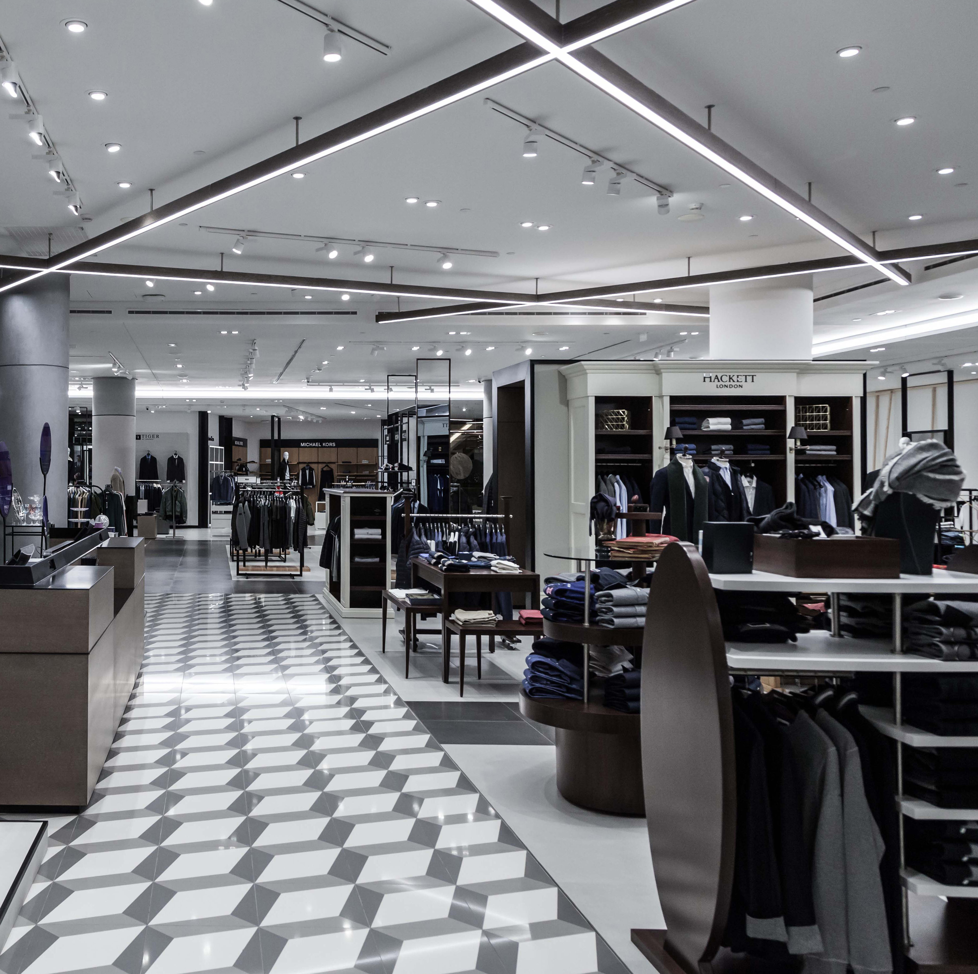
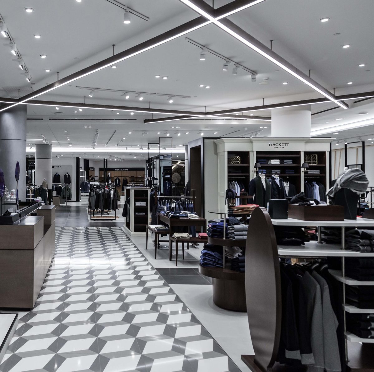
When Amyas Wade, Design Director at Kinnersley Kent Design (London), set about imagining ABC (Beirut), the plan was to devise a strong central identity in order to create a memorable destination. “If the experience isn’t instantaneous or visual when you walk in, you can lose half the customers,” says Wade. To this end, the store design makes a strong visual impact, with striking LED illumination and a monochromatic tiled floor.
To allow for product shift and brand evolution, designers built in flexibility and mobility by using a system of modular fixtures. In the jewelry department, for example, fixtures can be reconfigured into different shapes as needed, according to Wade. In the cosmetics department – a section that’s notoriously heavy on brands – flow is paramount. “You have to be able to see through to different brands, to be able to circulate,” says Wade. Fluidity and clarity are maintained throughout the store, via glass cases and scaffolding-style product displays that allow shoppers open sightlines.
Geometric archway fixtures provide a magazine-like backdrop for selfies, while constantly changing windows are part of the journey from online to in store. In the kid’s section, fixtures like peg walls and cutout trees have a pop-up book look that’s interactive and engaging. In the pipeline for future in-store elements are digital displays that integrate virtual reality (VR) with physical products.

ABC designed by Kinnersley Kent Design. Photography: Idepconsult – Mounir Saroufim and Partners, Beirut
FOOTWEAR IN MOTION
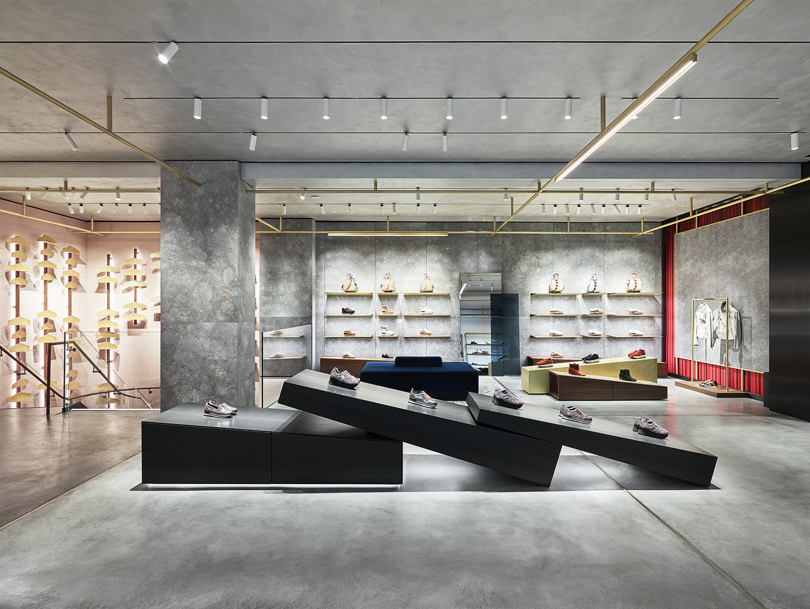
Luxury shoe brand Hogan’s (Sant’Elpidio a Mare, Italy) outpost on Via Montenapoleone in Milan was inspired by Umberto Boccioni’s sculpture “Unique Forms of Continuity in Space.” Joe Evans, Creative Director at Checkland Kindleysides (Cossington, U.K.), the firm tasked with the store’s design, explains that they’re no longer creating traditional stores. “Instead we’re designing brand spaces, where the customer can build connections through memorable and exciting experiences,” he says. “For this to be effective, it’s important that fixtures are mobile and flexible in order for the space to be used for events, activations and product launches.”
With hanging rails and standalone box displays, “the main form language of the store comes from the fixtures. We’ve created a collection of angled wedge shapes – an abstract of a stride in motion – in luxurious contrasting materials,” says Evans.
Shoes are merchandised in pairs and displayed on inclined surfaces, which adds to the sense of direction and dynamism. An ethereal frosted glass “movement wall” backed by digital visuals captures the vibe of the host city through animation and motion. It can also be updated for key brand campaigns. This flexibility allows for the planning of new layouts and the scaling of concepts.

Hogan’s designed by Checkland Kindleysides. Photography: Filippo Piantanida, Milan
FUNCTION AND FANTASY
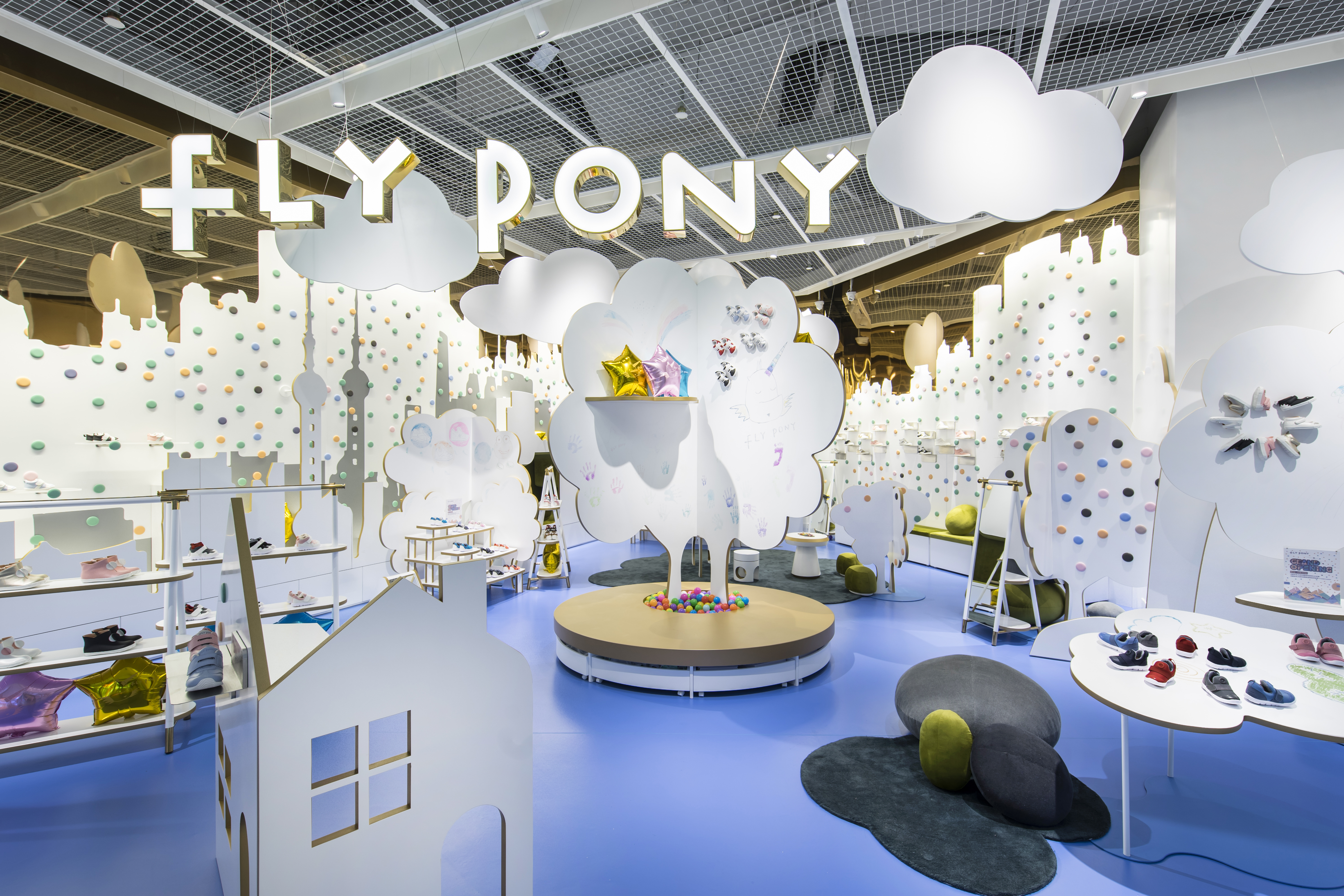
Fly Pony’s (Shanghai) in-store narrative centers around make-believe character Tim, who dreams of a magical and adventurous world. At the front of the store is an abstract interpretation of a street in Shanghai, with fixtures shaped as clouds, houses and trees displaying children’s shoes and clothes.
The design incorporates eight colors that are intended to represent Tim’s dream world. One is gold, which outlines the fixtures and shelving and represents courage, passion and innocence, according to Tomohiro Katsuki, Founder and Designer, Prism Design Consulting (Shanghai). There are writing boards for children to draw on, encouraging creativity, and accents suspended from the ceiling, and those that seem to rise from the ground, augmenting the sense of the surreal.
The colorful dots lining the walls – reminiscent of old-fashioned candy buttons – are both fixed and moveable, with some that support hangers and others that can hold shelving for the regular rotation of product, “blending function and fantasy,” says Tomohiro.
Across every kind of store, this year’s fixture trends are enhancing the experience through mobility and modularity. For ABC, this comes in the form of flexible fixtures and the flow from brand to brand. Hogan draws on a sculptural interpretation of movement for its design, while Fly Pony incorporates fixtures as props to support the brand story. In all instances, it’s a blend of immersion and in-store experience. However it’s done – from shape-shifting shelving to the future’s AR display cases – fixtures are driving the change.

Fly Pony designed by Prism Design Consulting. Photography: Katsumi Hirabayashi, Tokyo

