This month the Pantone Colour Institute revealed the color of the year for 2019: the exotic-sounding ‘Living Coral.’ According to Pantone, the hue was chosen:
“In reaction to the onslaught of digital technology and social media increasingly embedding into daily life, we are seeking authentic and immersive experiences that enable connection and intimacy. Sociable and spirited, the engaging nature of PANTONE 16-1546 Living Coral welcomes and encourages light-hearted activity. Symbolizing our innate need for optimism and joyful pursuits, PANTONE 16-1546 Living Coral embodies our desire for playful expression.”
It seems like a lot of symbolism to pull from one color, wouldn’t you agree? Yet Pantone’s decision is eagerly awaited every year by designers and marketers alike. Why? For one, Pantone is the authority for global color trend forecasts. But it’s also an expression of the influence that color psychology has on multiple industries. What is Colour Psychology?
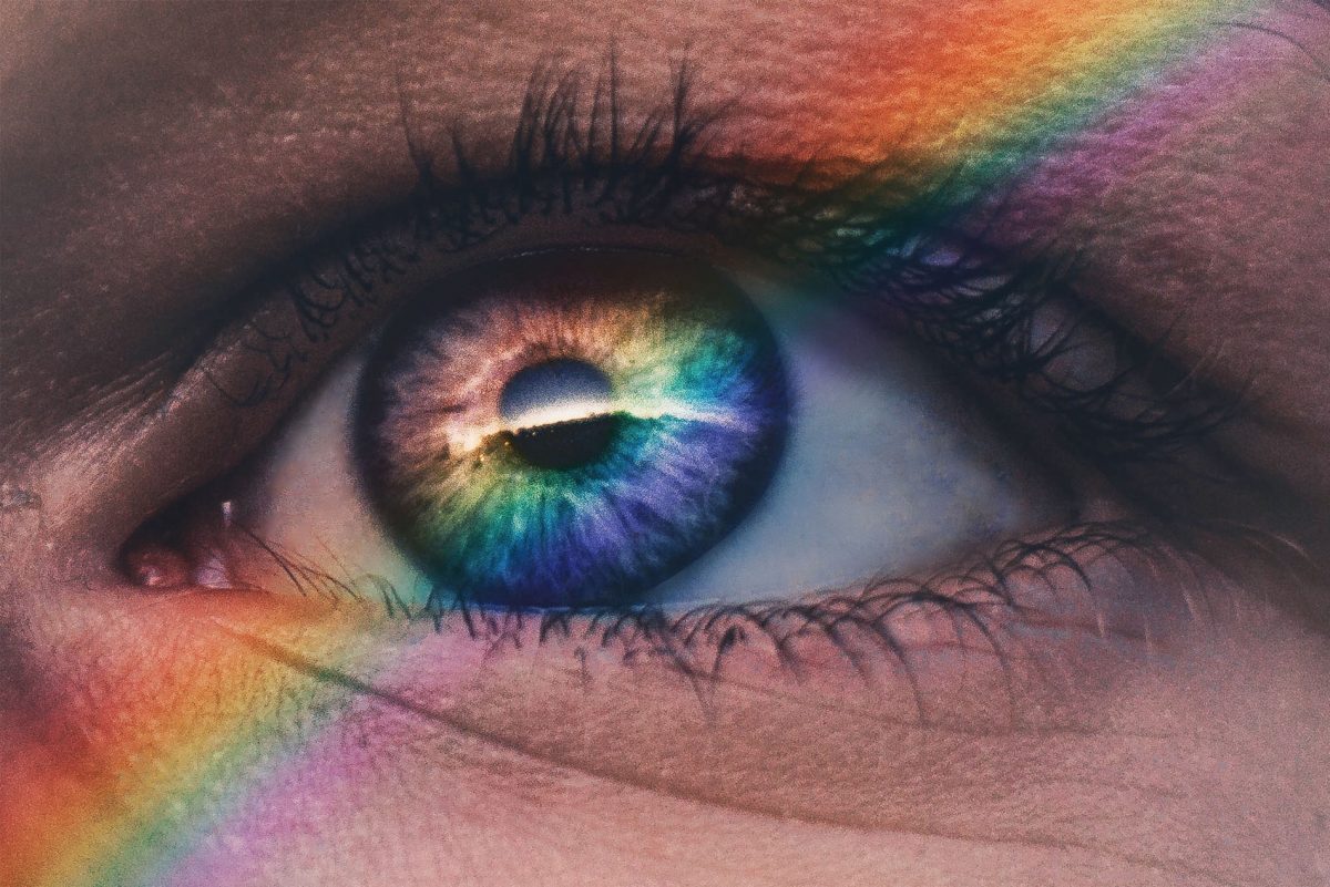
Color psychology looks at how color affects human perception and behavior. Humans are very reliant on sight, so visual information such as light, color and shadow are very important in how we perceive the world. This information is converted into electrical signals which our brain can understand, specifically an area called the hypothalamus, which controls our hormones and emotional responses. In theory, you can influence the kind of response that a person will have towards a physical space or an object, depending on the colors used.
Color psychology is not a recent invention. Ancient civilizations such as the Egyptians, Greeks and Romans all studied the effect of colors on behavior. The famous psychologist Karl Jung was particularly interested in its use in psychotherapy treatments. However, it was the world of branding which woke up the modern world to its potential. Not surprisingly, the idea of being able to influence how consumers perceive a brand served as catnip to advertisers.
The main principles of color psychology are familiar to most of us, like a nursery rhyme. We know that green is nurturing, blue is calming, and yellow makes people feel cheerful. But we aren’t going to hash it all out in this blog. There are already hundreds of blogs doing just that. The bigger question is: does color psychology actually work, or is it just a marketing gimmick?
 The biggest misconceptions about color psychology
It’s the same for everyone
The biggest weakness of color psychology is that it doesn’t see consumers as individuals. There are so many considerations in the purchasing process that it’s almost impossible to work out how much color actually plays a role. There’s cost, convenience, and past experiences with the brand to consider. Most of all, personal preference hugely dictates the colors we respond to. Life experiences shape how we perceive the world around us. Even the best branding strategy in the world cannot account for this! There’s a higher likelihood of us gravitating towards a certain product because it’s our favorite color, rather than anything the brand is trying to say through color symbolism. Putting too much belief in color psychology can contradict many key branding principles. Choosing the color blue because it’s the most liked, for example (almost one-third of people in the US rate it as their favorite color) is unlikely to pay off. From a marketing perspective blue is boring and unremarkable, so you are unlikely to stand out from the crowd.
It’s universal
Those nifty color psychology charts we see online put everything into neat little boxes, which is very palatable for readers. However, the symbolism is overwhelmingly Western-centric. The bulk of color psychology research is by Western universities and using western subjects. But we can’t assume that these ideas transfer seamlessly to non-western countries. For one, it doesn’t consider the nuances of culture. Red is widely associated with passion and carnal desire in the West. In China however, red is predominantly associated with luck and prosperity. If you are targeting an international market, these nuances are very important to be aware of.
It’s unchanging
Many of the associations we make through color are so ingrained that we often don’t notice them. But this doesn’t mean that color associations can’t change over time. The ‘pink for girls and blue for boys’ mantra is well known, but it wasn’t always this way. Pink was once actually considered a masculine color because it’s derived from red, which traditionally represents virility. This demonstrates that even ingrained cultural ideas are rarely set in stone. The famous London toy store Hamleys recently changed the colors of their ‘Boys’ and ‘Girls’ signage due to pressure from consumers, as many saw the colors as putting gendered expectations for children. It’s very important for brands to stay up-to-date with changing social norms, which might have a negative impact on their marketing efforts.
Is there any truth to it?
We all know that when it comes to branding, color does matter. Brands can spend months deciding on the exact shade and combo for their color palette, and with good reason. Your choice can make you unique and noticeable, or even a copycat within your industry. It’s difficult to imagine another tech company choosing all-white packaging, for example. Some of the most successful multinational brands have even trademarked their hues. ‘Coke red’ and Barbie pink’ are cases in point. So, color is definitely an important consideration. But does it really influence consumer perceptions that much?
Research has shown that color does have an impact on the retail experience. Up to 90% of first impressions about products are based on the color of their packaging. Considering that color is the primary information that our brains pick up, this isn’t surprising. Studies show that some colors are indeed associated with certain feelings. Blue is the most likely to represent competence and calm, and red excitement. However, it could be the presence of color that matters, rather what the color actually is. Another study from 2013 found that color plays strongly into the perceived ‘attractiveness’ of product packaging. Brightly-colored packaging inspired more impulse-buying behaviors in participants than plain packaging. This is because the brain receives more visual information, stimulating the reward-seeking areas of the brain that also trigger excitement.
In fact, the most important variable appears to be context. Some colors are associated with certain industries more than others. Green, for example, is the ‘norm’ for eco-friendly products. This association enforces the perception of a certain brand personality i.e. nurturing and protecting the planet. But it’s difficult to prove that this is due to an in-built emotional response to the color green. It’s more likely to be reinforced by consumer memory and past experience.
The verdict? Well, the evidence isn’t clean-cut. Color certainly plays a strong role in brand perception. Yet there isn’t a wealth of supporting evidence on the effect of specific colors on behavior. So, trying to play off stereotyped color symbolism might not be to a brand’s advantage. What matters more are the norms within your own industry. This means researching existing color schemes and popular branding, and choosing something which makes your brand distinctive from competitors. Ultimately, this is what will attract a consumer’s attention.
The Wrap up:
So, is color psychology all it’s cracked up to be? It’s a convincing pitch, but one that should be taken with a grain of salt. There is convincing evidence to show that color has a measurable impact on our purchasing decisions, but it isn’t an exact science. The right color combination can definitely make your brand stand out. However, nuances around culture, personal taste, and societal norms mean there are too many variables for perception to be under a brand’s full control. In sum, it’s much better to focus on what you feel is representative of your core brand values!