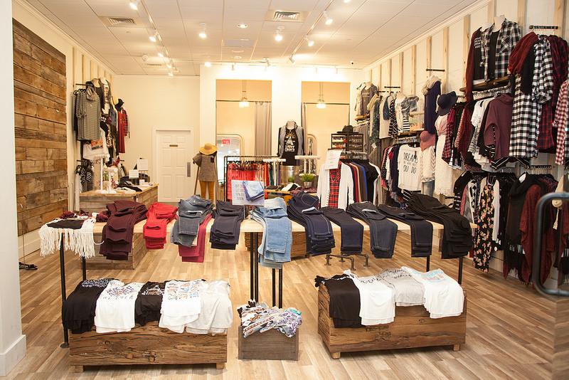
Ask any experienced and successful business leader in the retail world and they will tell you that a big part of their success can be attributed to customer psychology, and how they manipulate it on a daily basis using their store’s layout. There is a lot of careful planning and preparation that goes into a retail store’s floorplan, not because there is a need to maximize available space, but because there is a need to influence the shopper’s decision-making process.
By guiding your visitors on a shopping journey, you can inspire them to buy, and more importantly, fall in love with your brand and become your lifelong customers. Let’s take a look at the five tips to maximize your store’s potential through floor plan design.
Discover your ideal floor plan
There are many possible layouts you could try out, but the most effective ones that are most widely used around the world are the grid floor plan, the loop, and the free-flow layout. Choosing your ideal scheme will depend on the type of retail store you operate, as it’s not just a simple choice of which option you find the most appealing.
Typically, grocery stores will choose a grid plan, as it offers predictability and easy manoeuvrability – exactly what the grocery shopper is looking for. On the other hand, retail stores such as boutiques and specialty stores thrive on a more creative approach that allows them to guide the shopper and easily emphasize key products throughout. Basically, if you own anything other than a grocery store, you can try out the loop or the free-flow layout – the former emphasizing a circular path, while the latter will allow the shopper to peruse freely.
Guide the shoppers on a journey
Speaking of guiding the shoppers through your store, keep in mind that the best way to incentivize them to make a purchase is to remain in control from the moment they enter, to the moment they reach the checkout booth. You can achieve this by positioning pathways, aisles, displays, and racks strategically to accentuate certain areas of the store.
The first area customers will encounter is known as the decompression zone. This is the area where people get acclimated to their surroundings, so leave the first couple of meters empty as merchandise in this area tends to go unnoticed. Next, there is a 90% chance that they will turn to the right, so make the right hand wall your “power wall” where you will place your most appealing merchandise to reel them in.
Emphasize safety, functionality, and sustainability
Some of the most important elements of retail store design are safety, functionality, and long-term sustainability. The design of your store needs to stand the test of time and high volumes of traffic on a daily basis, so working with a commercial construction company during the planning phase in order to build a safe and resilient interior will prove to be an essential step that will maximize your investment.
You will need to work closely with your contractor in order to plan and build a contemporary retail store that serves an aesthetic as well as functional purpose that will in turn appeal to the modern customer while producing a positive ROI over the long term. With that in mind, be sure to use sustainable building materials and install durable flooring to boot.
Place your products into zones
Every retail store should have a zone for a specific type of products. These include high-demand goods, daily merchandise, discounted products, new arrivals, and more. While you might be tempted to simply display everything as it comes in, keep in mind that a bit of strategic positioning can go a long way.
For example, you can place common daily products that everyone buys towards the back of your store so that the shopper will have to pass the new arrivals and the discounts on their way to the item they intend to buy. Use the checkout area to position impulse-buy products that your customers can toss in the cart while they’re waiting in line.
Don’t forget about comfort and manoeuvrability
Finally, it’s important to note that comfort and manoeuvrability play vital roles in shaping your customers’ experience in your store. You’ll want to make your aisles wide enough to avoid the dreaded “butt brush” effect and inspire everyone to peruse freely without hesitation. Make every area easy to manoeuvre and don’t forget to create rest areas with comfy furniture so that the customer can take a breather, recuperate, and resume their shopping journey.
The way you structure your store’s layout can have a profound impact on the future of your brand as a whole. With that in mind, be sure to implement these tips in order to discover your ideal floor plan that will set you apart from other stores and transform potential customers into loyal shoppers.

