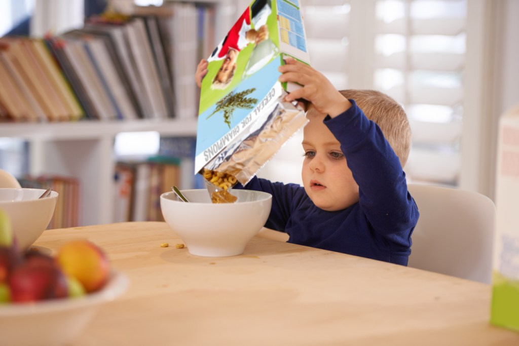
If you thought designing food packaging for children these days simply means using bold colors and throwing in a mascot of some sort, you’re in for a few surprises. For one, the competition is fiercer than ever as kids’ versions of meals, snacks and drinks are becoming the norm rather than the exception. Secondly, millennial parents are significantly more health-conscious than previous generations, which means your packaging must be irresistible to children as well as adults. Don’t know where to start? Discover our tips below to get cracking straight away!
1. Bold colors aren’t always better
Children are drawn to color like bees to flowers. Don’t forget, however, that parents are more likely to (subconsciously) follow the rules of color psychology. In other words, don’t pick your colors willy-nilly but make sure they match the product. Fluorescent hues, for example, give off an artificial vibe, which is the last thing you want when you’re trying to sell organic foods or drinks.
2. Tell a (brand) story
Storytelling speaks both to children and adults of all ages. Parents not only look for healthy food and snacks – mind your labels! – they also want to know where those ingredients come from and what the brand in question stands for in terms of sustainability. Fortunately, most brands already got their brand story covered. All you have to do, then, is get your graphics to match that story.
3. Design food packaging with a fun factor
 Remember how many mornings you spent as a child reading the back of the cereal box while eating breakfast? Children still do that, so it never hurts to include a fun game or riddle in your food packaging design to keep them interested and engaged. Mind you, you’ll hardly be the first designer to think of this. If you really want your food packaging to capture children’s attention, look into what’s trending among the age range you’re catering to. Piggybacking on popular toys, games, books, movies and TV shows is always a great idea. Inspired by Brand Packaging

