With in-store consumer spending slowly bouncing back around the world after months of lockdown, there are also new retail openings to look out for. Below, we share physical spaces from Dior, VanMoof, Kith, Marni, Acne Studios and Aesop that have emerged in markets from the US to Asia. While they may not be trafficked by tourists for the foreseeable future, the retail locations invite local customers to shop off-screen this summer – with proper safety precautions, of course.

Photos: Ewout Huibers
BERLIN: VANMOOF
Ninetynine
With a mission to get as many urbanites on bikes as possible, Dutch brand VanMoof has opened its first store in Berlin, a 175-m2 space. The retail concept – which centres on the idea of a ‘Dream City’, one free of pollution – is a collaboration with Amsterdam-based studio Ninetynine, and has been implemented in brand stores globally. ‘All VanMoof stores are designed as a natural habitat for the bike,’ explains a representative for Ninetynine. ‘There’s uniformity in material, as the interiors of all the global brand stores were produced in one location before being shipped around the world. Every store has three main functions: showroom, service point and test-ride center.’
Location Torstraße 42, 10119 Berlin, Germany

Photo: George Messarita
MYKONOS: DIOR
Dior has introduced two new pop-ups on the Greek island of Mykonos, to highlight its Dioriviera collection. One location is in Nammos Village – where Dior had a presence last year as well – while the other in the centre of Chora, Mykonos’ capital. The first is set in a sun-drenched, two-level space, furnished with items from the Dior Maison line. The Chora spot is situated in a traditional house, reimagined in pastel blue and adorned with pieces by Roman artist Pietro Ruffo. Both were designed in-house.
Nammos Village Location Psarou Beach, Mykonos 846 00, Greece

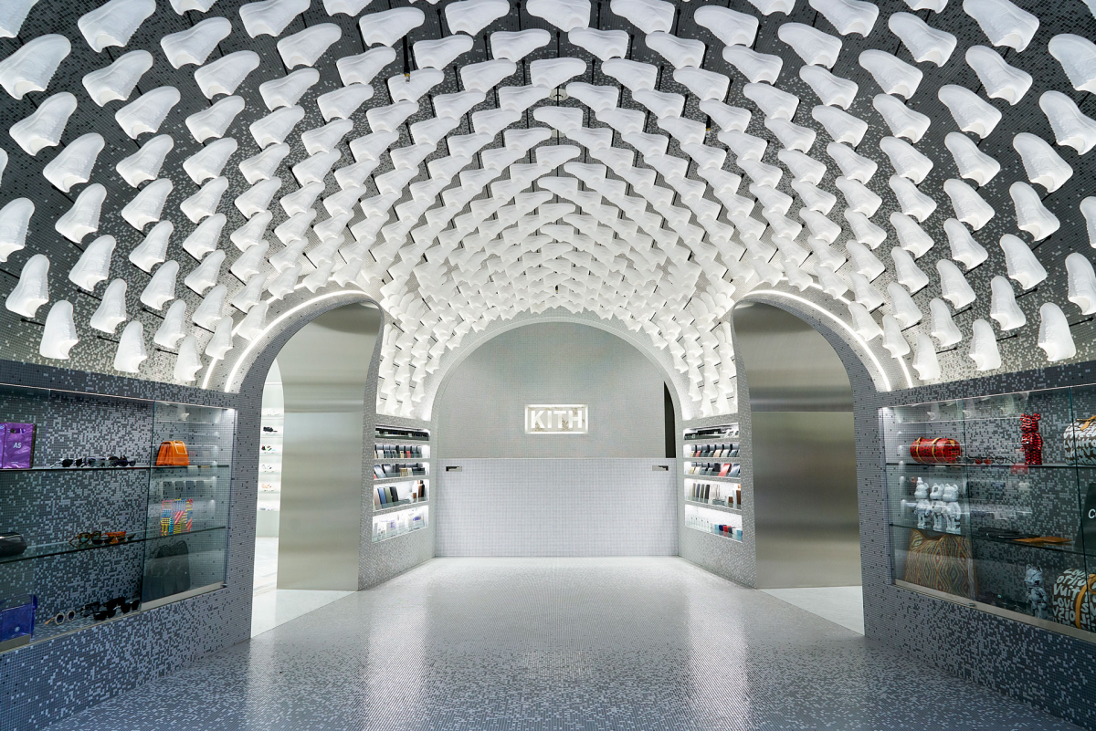
Photo: Courtesy of Kith
TOKYO: KITH
Snarkitecture
Built to coincide with Kith’s 10th anniversary, the American fashion brand’s Tokyo flagship – its first international store – can be found in Shibuya’s Miyashita Park North development. Designed by longtime collaborator Snarkitecture, the flagship is decked with Carrara marble, an interior signature for Kith. It has areas for men’s, women’s and children’s products, as well as an outpost of Kith Treats, which offers ice cream in flavours unique to Tokyo. With two floors, a 30-m façade and 743 m2 of retail space, the store is sure to leave an impact on the Japanese market.

Photo: Courtesy of Marni
NEW YORK CITY: MARNI
Marni has totally reimagined its store in NYC’s Meatpacking District, unveiling a new concept called Marni Meatpacking Market. The 250-m2 space hosts women’s and men’s collections, in addition to Marni Market lifestyle products which includes furniture, chairs, home objects and a range of bags that are a collaboration with Colombian artisans and reinterpreted seasonally. The brand’s in-house designers maintained the existing features of the space while introducing new elements, ‘juxtaposing industrial fixtures with sophisticated materials and Marni signature colouring’ according to a spokesperson.
Location One Gansevoort St, New York, NY 10014, United States

Photo: Courtesy of Christian Halleröd
BEIJING: ACNE STUDIOS
Christian Halleröd
Swedish architect Christian Halleröd and Acne Studioshave teamed up on the fashion brand’s third Beijing store at the new department store SKP-S. Sleek materials come together in the minimalistic space, with white walls and light-brown carpeting. Max Lamb and lighting designer Benoit Lalloz, whose creations also appear in other Acne locations – including its Stockholm headquarters – have created displays and fixtures for the Beijing spot.
Location 87 Jianguo Rd, Shilipu, Chaoyang, Beijing, China

Photo: Courtesy of Torafu Architects and Buaisou
YOKOHAMA: AESOP
Torafu Architects
Torafu Architects collaborated with Japanese collective Buaisou to build a defining curved wall for Yokohama’s newest Aesop post at the NewOMan shopping mall. Natural indigo dye was used to colour the maple boards used to construct the wall; the tree species was selected after experimentation to see which would be most compatible with the technique. ‘Each indigo-dyed board has a rusticity and boldness not seen in a uniform material,’ explains a spokesperson for the architects of the natural gradation. ‘The design was intended to create create a feeling of the human hand and the power of nature.’

