The Pantone Matching System, RBG, CMYK, HEX codes… choosing colors for your custom printed packaging can quickly get overwhelming. If you are new to packaging design, sorting through color guides can easily send you down a rabbit hole filled with questions.
What is the difference between the RGB, HEX, Pantone, and CMYK color spaces? Most importantly, how will this affect my chosen packaging design? If this is weighing on your mind, you definitely aren’t alone!
If you want to bring your dream color combination to life, you’ve come to the right place! In this how-to guide, we will give you a thorough breakdown of the different color spaces associated with custom printed packaging, and how they work in relation to noissue’s design tool.
What is ‘Color Space’?
What is the Difference Between RGB, CMYK, HEX and Pantone Color’?
The Pantone Matching System (PMS)
CMYK
RGB (Red, Green, and Blue)
HEX (Hexadecimal Color)
How We Use Color Spaces for noissue Custom Packaging

What is ‘Color Space’?
Color is very subjective because we all see the world slightly differently. (This is what leads to pointless disagreements over whether someone’s dress is ‘coral’ or ‘peach’). The term ‘color space’ refers to a system that organizes color to prevent printing errors.
Different color spaces also have different uses. RGB and HEX are only for on-screen use, while others such as CMYK and the Pantone Matching System are used for offline scenarios.
By standardizing color models in this way, it ensures that printers and designers are always on the same page.
What is the Difference Between RGB, CMYK, HEX and Pantone Color?
This is where things can get a bit confusing. Printing companies frequently throw around terms like ‘HEX code’ or ‘spot color’, leaving their clients struggling to keep up. This is a problem, because there are big differences between color spaces and their associated print methods.
For a business, brand consistency is the key to building recognition. So, if your color scheme varies across your collateral, this undermines the cohesiveness of your brand.
For example, if Coca-Cola suddenly started using a different shade of red for its product packaging, we would definitely pick up that something was ‘off’.
This is why it’s so important to understand the difference between color spaces and how they are used when designing your custom printed packaging.
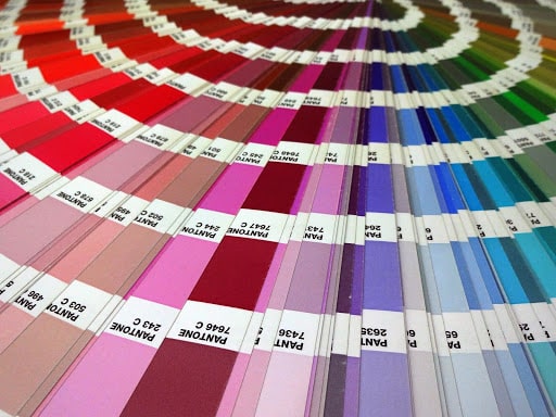
The Pantone Matching System (PMS)
The Pantone Matching System (PMS) is a spot color system that is designed to reproduce consistent shades across printing facilities. A spot color system is where each individual color is printed one layer at a time using its own plate. The more colors in your custom packaging design, the more ‘spots’ are printed.
For example, if you have ordered two-color custom tissue paper from noissue, this is considered a ‘two spot’ design for printing.
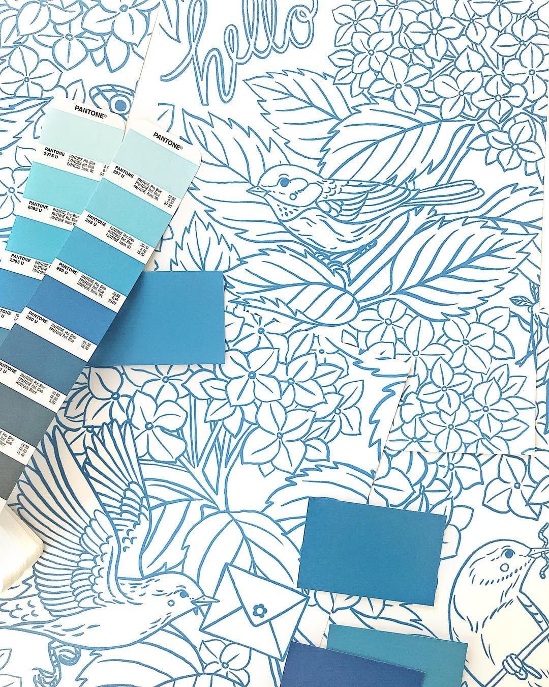
Illustrator Oana Befort using Pantone Colors to design her custom tissue paper.
How the Pantone Matching System Works
The Pantone System contains over 1000 separate shades, which are composed of 18 core colors mixed to exact formulas. These are available within the official Pantone formula guides (carried by all professional printers). This ensures that a certain hue is 100% accurate every time.
Every Pantone color is assigned its own number, followed by a suffix that describes the paper stock. The code PANTONE 2271-C, for example, is a green on coated (glossy) paper, whereas PANTONE 116-U is a light orange on uncoated (untreated) paper.
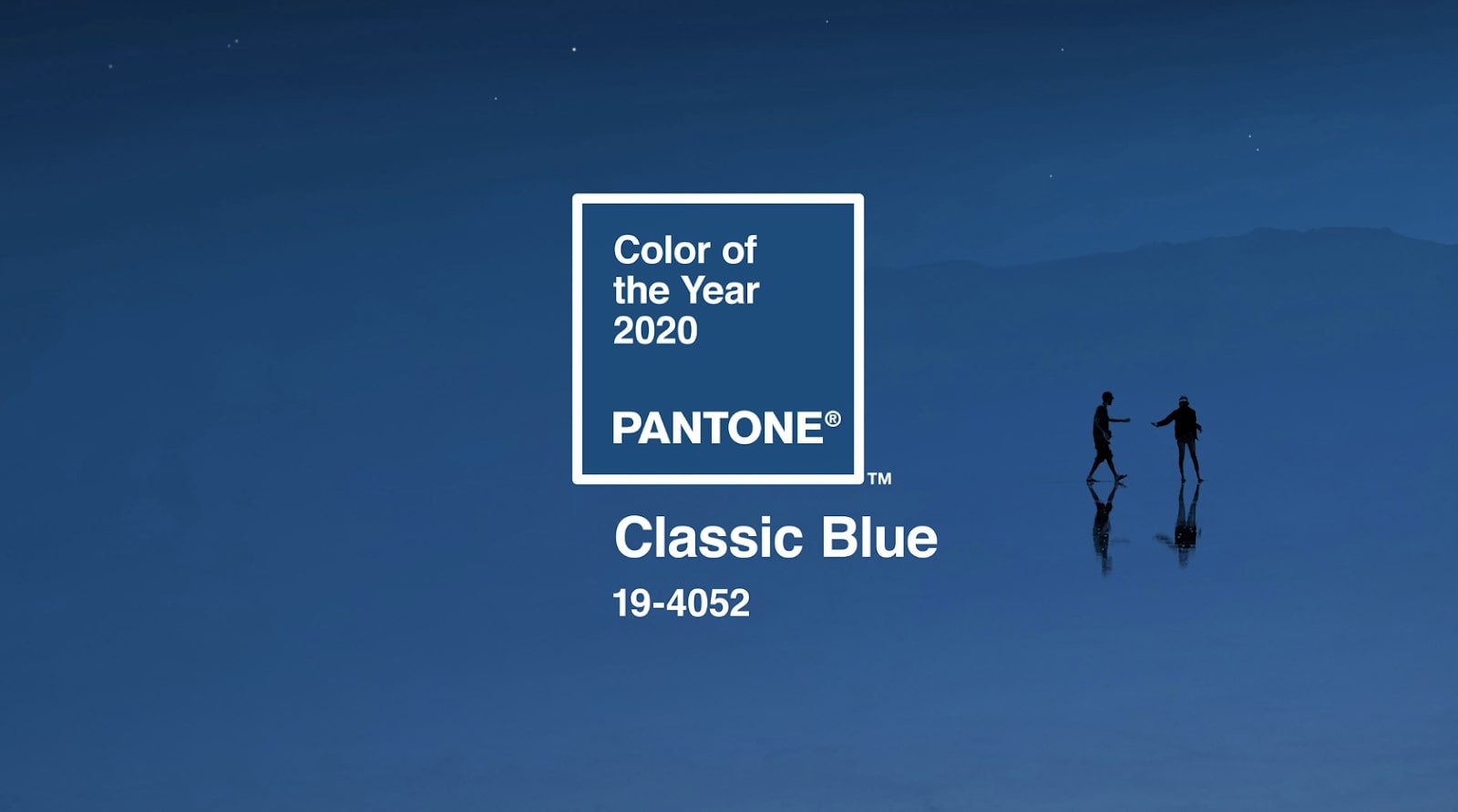
Not surprisingly, Pantone has a big influence on a variety of industries. The announcement of Pantone’s ‘Color of the ‘Year’ is eagerly awaited by interior and fashion designers alike to set trends for the coming year.
For the record, Pantone’s color of the year 2020 is PANTONE 19-4052 – known as ‘classic blue’.
Advantages of the Pantone Matching System
Because it ensures such consistency between print runs, Pantone has become the universal color space system for marketers and designers (and custom packaging suppliers!) Some businesses, such as Cadbury’s, have even successfully trademarked certain Pantone shades.
Because it has become so standardized, Pantone charts include helpful color matches to other spaces. Let’s look at our signature noissue pink as an example:
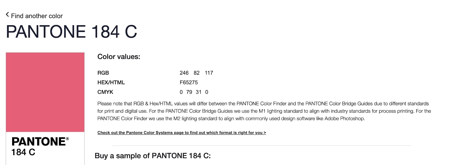
As you can see, searching for a particular code on Pantone’s website will also bring up how to convert Pantone to CMYK, RGB and HEX. This makes it easy for designers to keep color consistent across different platforms.
Disadvantages of the Pantone Matching System
Because all Pantones have to be laid down in a single print run, custom product designs that involve multiple Pantones are time-consuming to print and can be very expensive. If your design has four or more colors, it may not be the best option.
CMYK
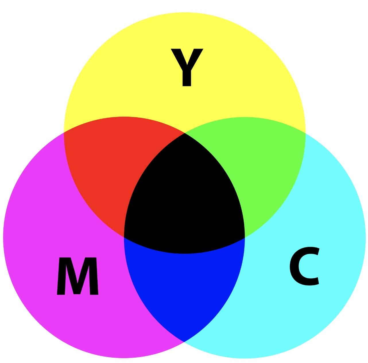
Most people are familiar with this color space system as it’s used by conventional home printers. CMYK stands for ‘Cyan Magenta Yellow Black’ and refers to the four colors used in process printing. Process printing, as opposed to spot color printing, is when the inks are printed in small dots that overlap to create the needed color.
You can see how this overlap works through the following diagram:
How CMYK Works
CMYK is known as a ‘subtractive’ color process, which means the more color that is added, the darker to end shade will be. Because every CMYK shade is a combination of the above four colors, the formula is expressed as a percentage of each.
For example, if you refer to the chart of PANTONE 184 C above, you will find that its CMYK conversion is Cyan: 0% Magenta: 79% Yellow: 31% Black: 0%.
By comparison, 100% in Cyan, Magenta, Yellow, and Black would simply result in black (hence the overlap in the middle of the diagram). To convert CYMK to Pantone color, you can also use the Pantone Matching System Color Bridge guide.
Advantages of CMYK
If your custom printed packaging contains multiple colors, CMYK printing is much more economical than spot color printing methods like PMS. Because the presence of the four colors can be adjusted, there is also a practically unlimited number of shades available.
Disadvantages of CMYK
Compared with spot color printing, like the Pantone Matching System, CMYK is less accurate and there is a chance that colors can vary across print runs or different printing units.

RGB (Red, Green, and Blue)
RBG is only used for rendering digital images on TVs, computer screens and cellphones, rather than for printing. These three colors are mixed together to produce a broad spectrum of colors.
How RGB Works
RBG is the opposite of CMYK in that it is an additive color system. When red, green, and blue are mixed at 100% vibrancy, they produce white rather than black. Each color is expressed in the RGB formula as being on a scale of 0 (least vibrant) to 225 (most vibrant).
Remember our friend PANTONE 184 C? In the RGB color space, this translates to R 246, G 82, and B 117.
Advantages of RGB
Because RGB is the standard system for screen displays, it is compatible with all design software and editing tools. It also allows for a very wide range of colors in the display, which is beneficial for design work that requires very precise shades.
Disadvantages of RGB
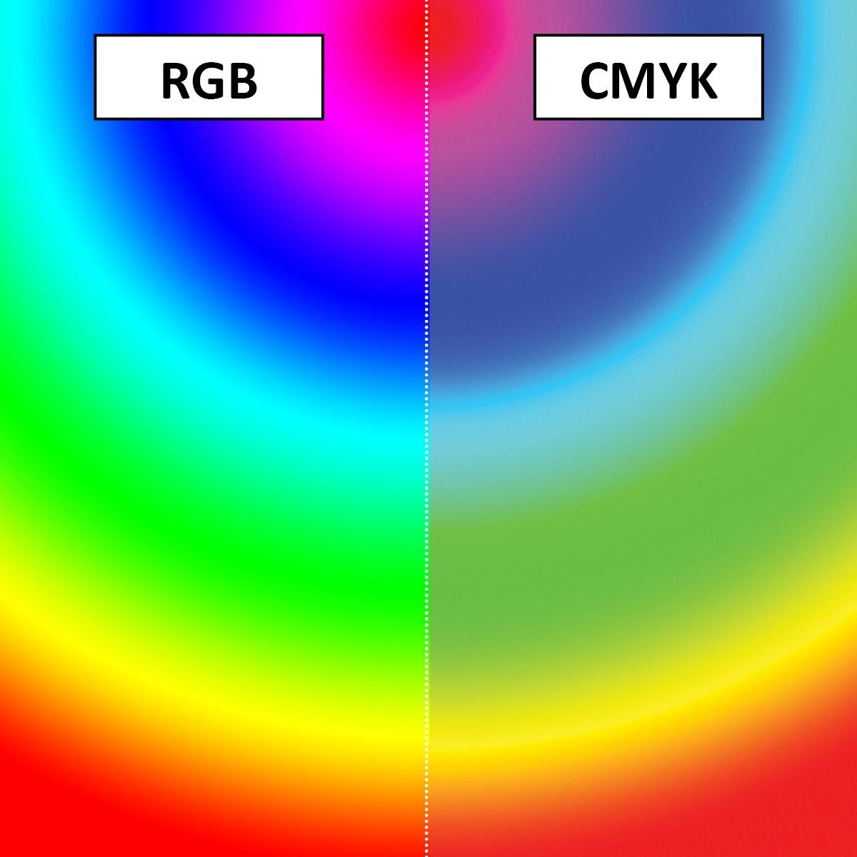
It is important to be aware that RBG colors appear more vibrant than they really are due to being illuminated by a screen display. This can cause issues with printing, especially when converting RBG to CMYK. When using process printing, the final product can look noticeably duller than it does onscreen:
HEX (Hexadecimal Color)
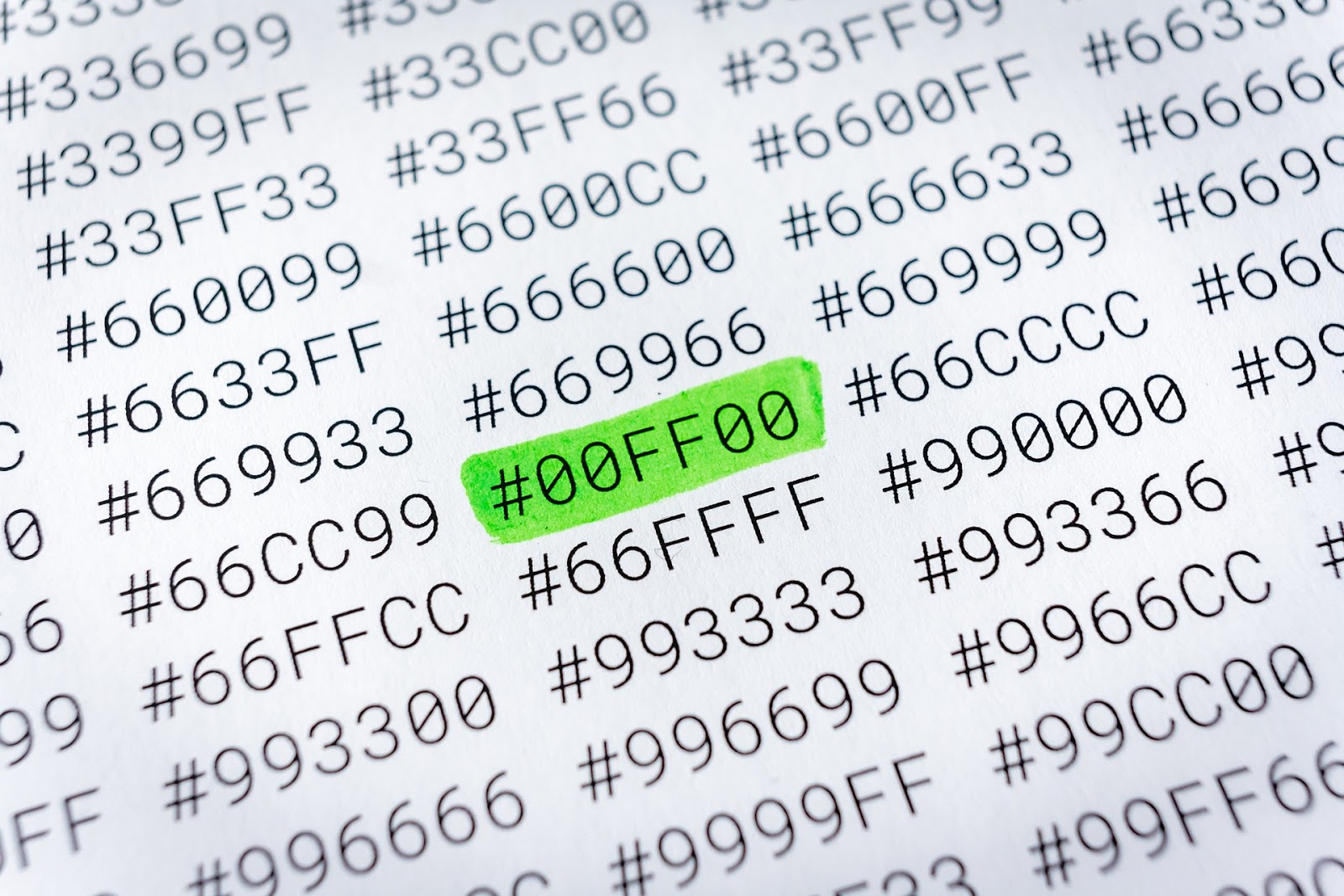
The hexadecimal color space is a form of HTML code that is used in web design. Most of us are pretty familiar with HEX, as it is used in word processing programs like Microsoft Word or Pages.
HEX codes ensure that the colors you are using for your packaging design are ‘web-safe’, meaning that they will display consistently across different browsers and screen displays.
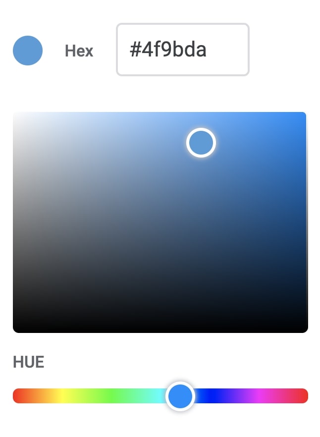
A HEX color example from Google Docs.
How HEX Works
HEX has a strong crossover with traditional RGB, as each color is expressed by the mix of red, green and blue it contains. A HEX code can be identified as a hashtag followed by a six-digit code, which defines the exact shade being used on the page. If you are interested in how HEX codes are calculated, there is a great guide on Medium.
Advantages of HEX
HEX is very compatible with offline color spaces (we will get onto this in a second) so it’s straightforward to use within design programs. Although the coding behind the HEX gets quite complex, it’s not necessary to understand this from a design standpoint. Once you have the code, it’s easy to reproduce.
Disadvantages of HEX
Unless you are using a third-party tool, adjusting HEX codes to get different shades isn’t a very intuitive process, especially if you don’t have much knowledge about HTML. However, there are a lot of helpful HEX code creators online where you can manually adjust different levels to produce the desired color.
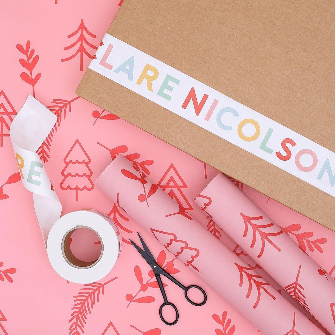
How We Use Color Spaces for noissue Custom Packaging
Now that we have a grasp on the different color spaces, we can take a look at how they are used in relation to noissue’s packaging solutions!
noissue’s design tool allows you to upload your design or logo and create high-quality, custom printed packaging completely from scratch. Once your logo is uploaded, you can choose from any of our templates, change its orientation and size, and most importantly, choose your color palette!
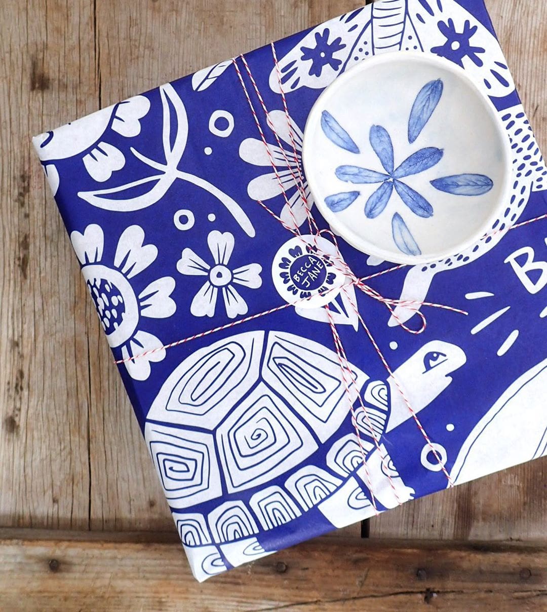
Custom Tissue Paper
For our custom printed tissue paper, we use the Pantone Matching System (PMS), which allows our customers to specify certain shades that they are already using in their branding.
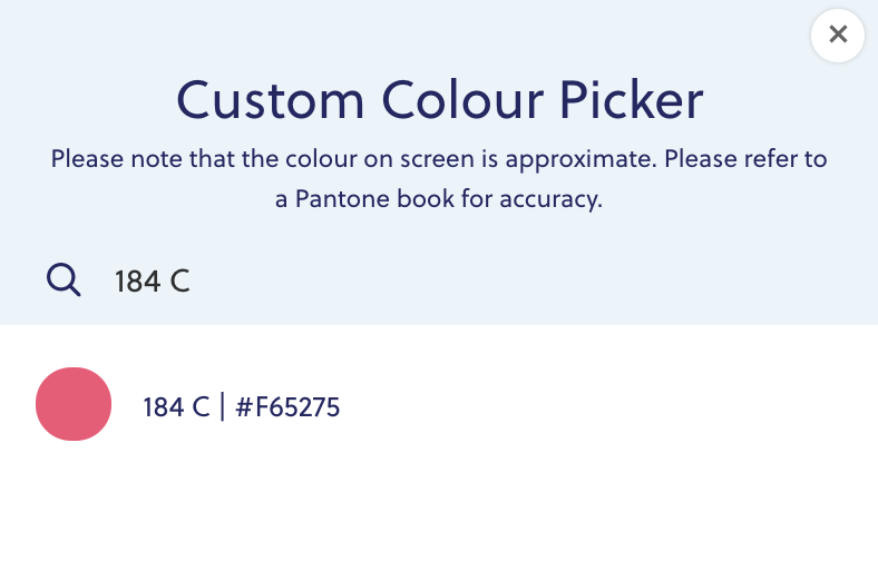
To make sure there is consistency between our design tool and the final product, our custom color picker translates HEX codes to Pantone to ensure the correct display on your screen. That way, you know exactly what you will be receiving in three weeks’ time!
As an example, let’s use our trusty PANTONE 184 C once again. When you pull up our custom color picker, you have access to a massive library of shades. You can either browse through if you don’t have a specific color in mind or input the exact Pantone / HEX codes you want, and our converting tool will get to work:
To add a second color to your packaging design, you can do so in the sidebar.
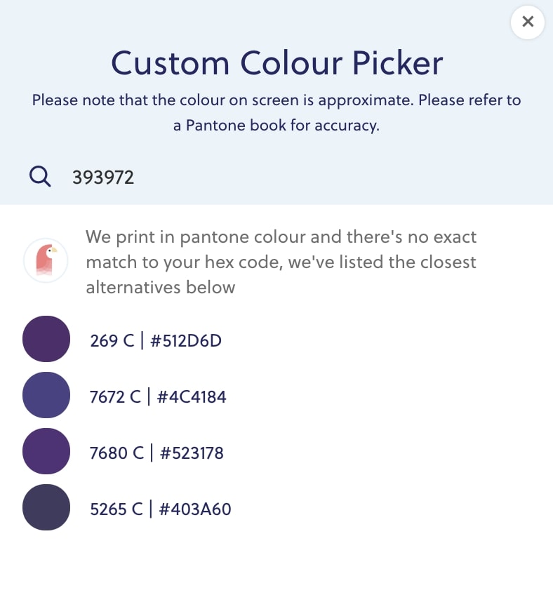
If you happen to be using a HEX code that doesn’t have a direct conversion to the Pantone Matching System, our color picker will match you with the closest available shades:
If you would like more than two colors for your custom tissue, you can reach out to our friendly team to arrange it (we charge a fee for each additional color). However, we cannot print more than six colors in a single design.
Two-color designs will always be printed on our 28 GSM tissue paper, due to the amount of ink required. If you have any questions about GSM, check out our dedicated guide.
Note: Because white is the base color, we do not charge for its use. Therefore, you can technically get three-color tissue for the price of two if you use white in your design!
Custom Printed Paper Stickers and Custom Packing Tape
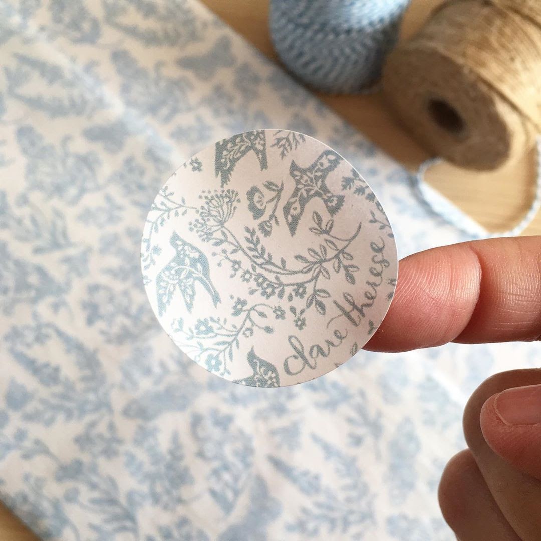
For our stickers and tape, we use CMYK process printing instead of the Pantone Matching System. This is because CMYK is more efficient for custom printed packaging that needs 100% color coverage.
You can still specify Pantone colors or HEX codes in our custom color picker. However, there may be a 5-10% difference in tone between your custom tissue paper and your stickers or tape. If you have any concerns, feel free to reach out to us!
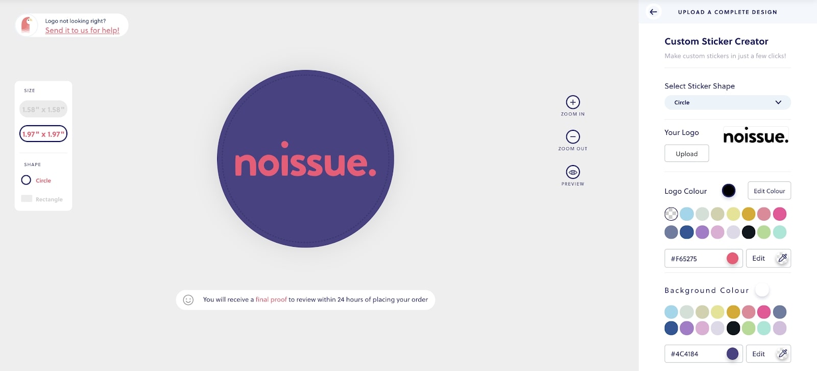
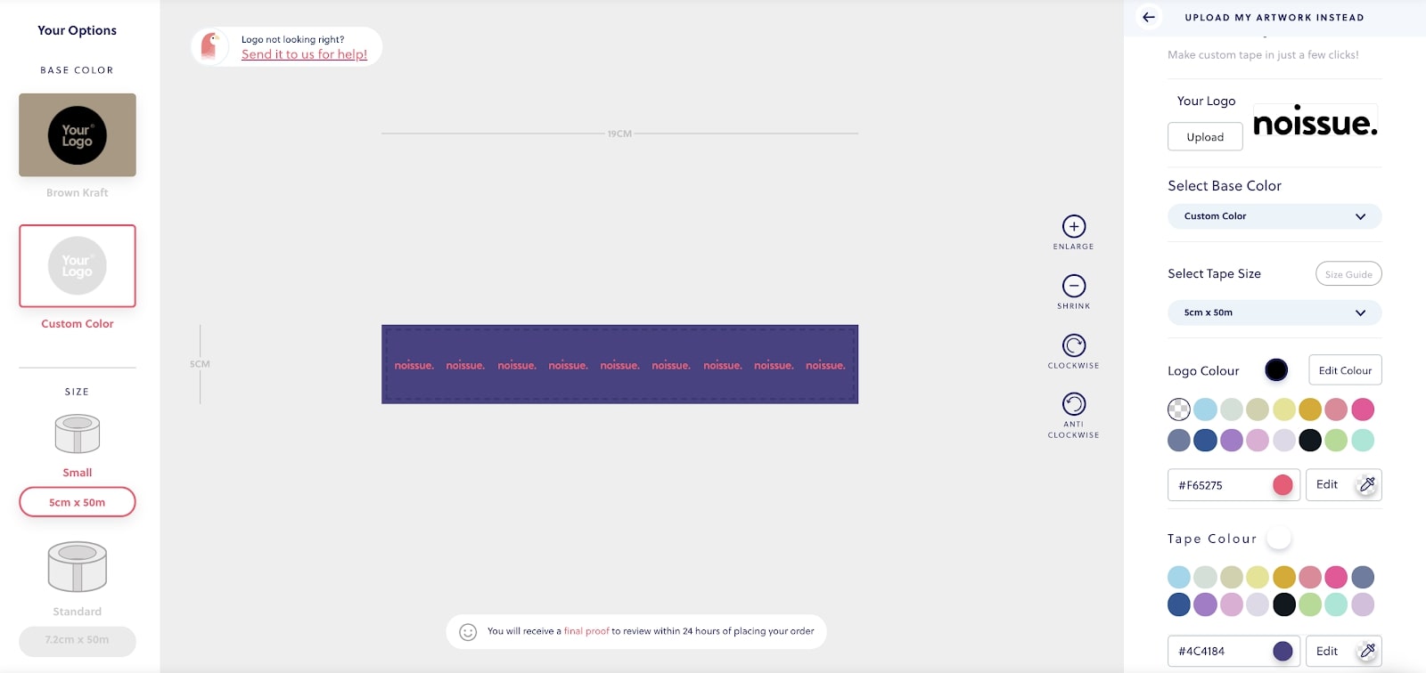
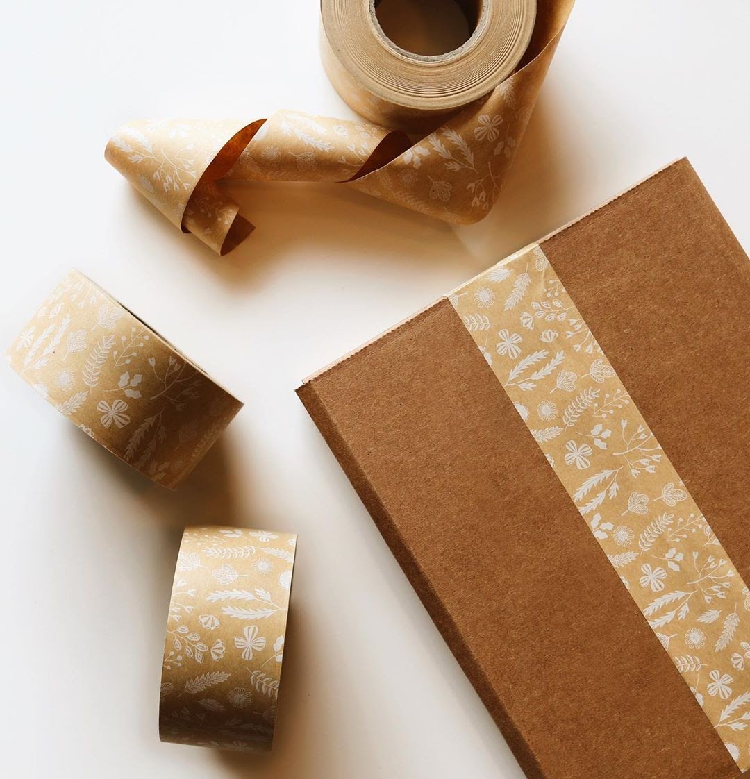
You can pick two colors for a standard design for both custom stickers and tape – one for your logo and one for your base color. For custom tape, you have a choice between brown kraft or a custom shade as your base color, depending on your preference. Both create excellent results!

And there we have it! In this post, we have covered the difference between the Pantone Matching System, CMYK, RGB and HEX, and the pros and cons of each in relation to custom printed packaging. We hope that our quick tutorial on using color in the noissue design tool answered any questions you might have! If you have any other concerns, feel free to reach out to our team!
Want to know more about custom packaging? Check out our blog!

