Luxury is in the eye of the beholder – yet there are plenty of materials, colors, fonts, shapes, … designers typically use to create luxury packaging that exudes pure style and prestige. Stuck for inspiration? You can’t go wrong with the luxury packaging design trends we’ve got lined up for you!
1. Metallic packaging materials
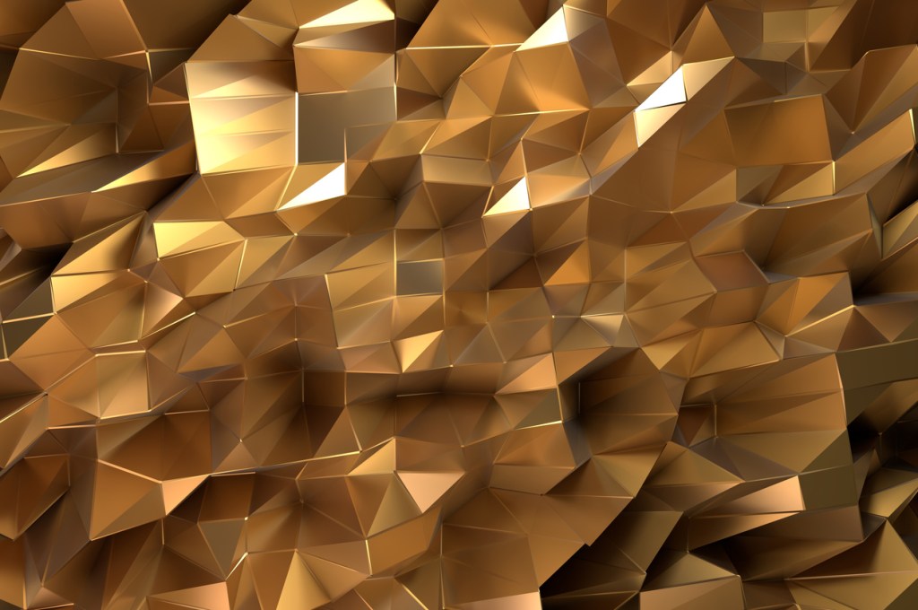
 All that glitters might as well be gold! Or bronze, or silver, … There’s something about metallic packaging that evokes a sense of royalty. Throw in a regal-looking crest or emblem and you’re off to a great start! Afraid your design won’t stand out in a sea of precious metals? Stick with subtle metallic accents and don’t hesitate to combine matte and shiny surfaces.
2. Sleek and seamless … or shaped like a diamond
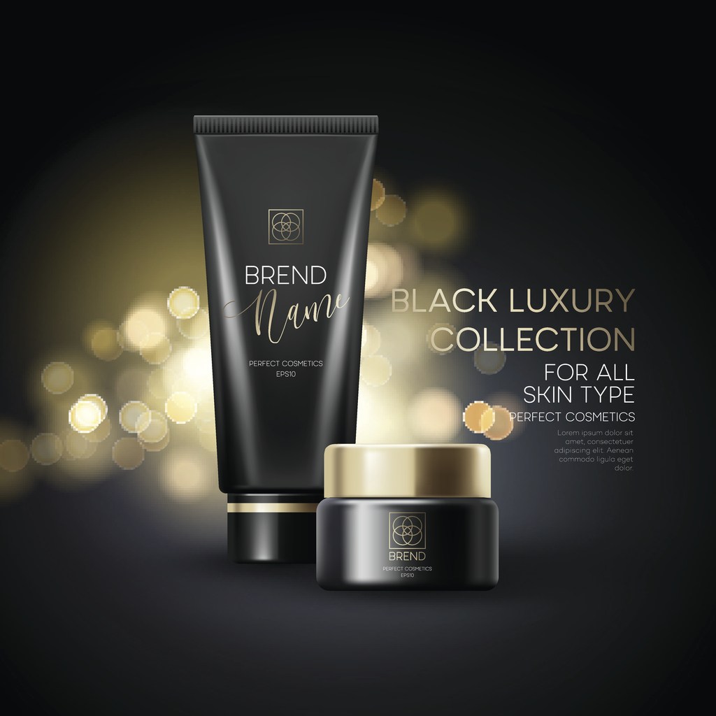
 Shape-wise, you can’t go wrong by keeping it simple with a sleek silhouette. Mind you, the most successful luxury packaging designs always appear exclusive. If your budget allows for a custom mold, go for it! Luxury packaging shaped like a jewel, for instance, is known to sell well. Extra tip: if you’re designing a bottle, giving the body the same color as the cap will make it look extra-sleek.
3. Sticking to the essentials
In the world of luxury packaging design, simple does it. While elegant, curvy fonts are evidently not out of the question, make sure to keep everything else minimal. Negative space is a good thing!
4. Muted color palette
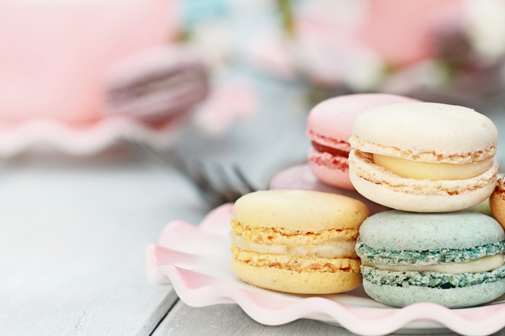
 Next to white, black and metallic hues, most luxury brands have a preference for a muted color palette. Think dusky pink, mint green and all other kinds of pastels.
5. Luxury packaging designed for unboxing
 The ultimate ‘trick’ to make your luxury packaging go viral? Design it so that it looks like a gift! In other words, make sure to include the transport packaging in your design efforts as well. The unboxing experience starts the second the package arrives on the customer’s doorstep, so a boring brown cardboard box is a definite no-no. Inspired by Brand Packaging

